Monday, December 17, 2012

Art Deco in Los Angeles


I went on an architectural walking tour in downtown that focused on Art Deco buildings. I enjoyed every part of it (except for the part where the tour guide would get mad at me for falling behind the group because I was staring too long or taking too many photos). Other than that it was truly inspirational!


Art Deco design has really beautiful and strong characteristics and even though an entire space dedicated to that style might not be my personal taste, incorporating certain Art Deco elements or pieces into an interior can add that extra needed layer. The shape of a building can be inspiration for a custom table, a coiffered ceiling can be adapted to a more contemporary dining room, and metal carvings around a door can be translated into embroidery designs for bedding or pillows. I'm finding that taking things from the past and putting my own spin on them is the best way to create layered and interesting interiors that have depth and are uniquely my own.


Monday, November 26, 2012

Holiday Tips in Newport Beach Magazine


I was contacted a couple of months ago by Newport Beach Magazine to offer up some holiday decorating tips. I sort of forgot about the article, but with Christmas just around the corner, it popped into my head this morning and sure enough, it had been published in the November issue.

It was quite a few years ago now that I stumbled upon my love and knack for holiday decorating. It's actually kind of a funny story. Back when I was young, naive, and fearless I had quit my design assisting job in Laguna Beach with a little money in savings in the spring to start my own design company. As anyone with entrepreneurial experience knows, Rome wasn't built in a day, so by the time fall rolled around I was in need of some extra cash to get me by and I took a temp job answering phones for a commercial real estate firm. The firm owned the Laguna Design Center properties in South Orange County and due to some shifting around, the general info calls going to the design center were temporarily being forwarded straight to me.

One day a women called the design center looking for a recommendation for a designer who could help decorate her home for Christmas. I enthusiastically told her that I had a "friend" who was a very capable designer and that I was sure she would be happy to help, so I passed along her/my personal contact info. My cell phone buzzed on vibrate immediately after we hung up the phone and she left a voice message. I promptly called her back on my break and the rest is history. I had never made custom wreaths and garland before, nor did I have any clue on how to estimate a budget or quantity of items needed for such a project, but somehow I made it work and she loved it.

I've had a love of holiday decorating ever since and much like window displays and wedding design, I love the whimsical aspect of creating more temporary settings. Residential interiors with all of their furnishings, textiles, lighting, and architectural details will always have my heart completely, but it's nice to take a break every now and again to create something much less permanent and use a greater sense of whimsy.

The Manhattan Apartment of John Robshaw


The cover of Elle Decor really caught my eye this month. So much so that I almost bought it off the shelf instead of waiting for my copy to come in the mail. This is the Manhattan home of John Robshaw. I didn't know that by looking at the cover photo, but judging by the wonderful mix of fabric and furnishings I wasn't surprised when I found it out. He's a master of textile design; traveling the globe 3 months out of the year to get inspired and work with artisans from Central and South East Asian and India, among other regions and cultures rich with pattern and color. His approach is to find ways to improve upon their original and historically rooted designs to make them deeper and more relevant in a contemporary setting. His ability to layer, mix, and match is captured so effortlessly in his living space shown above (and throughout the rest of his home). It's something that I am constantly trying to achieve and improve upon in my own aesthetic.

Monday, September 10, 2012

Framing Art


As much as I sometimes wish there were, there aren't straight forward rules for framing artwork in my design world. A frame and mat that will work for one art piece in one interior will surely be different if hung elsewhere. And if art is hung solo rather than in a group, again, the rules seem to change.

The key is to go with your gut if you're visually inclined, or find a really great frame shop that can help guide your decision if you're lacking that artistic eye. Even though I usually know what I'm looking for, I still really value the opinion of my local frame shop. They appreciate art and do this on a daily basis and two heads are always better than one.

I'm planning a gallery style art wall for a client's living room. It's a mix of their beautiful oil paintings and antique maps from Italy, and a few eBay finds thrown in to mix things up a bit. It's a coastal home with a lot of blues and grays in the fabric and wall color and a variety of wood tones throughout.

To find the delicate balance mentioned above I first consider the color and subject matter of the piece of art. For the larger oil painting in the grouping, gold was my first inclination. Gold is always a great standard for oil paintings and in this instance it was perfect for the color palette of the coastal scene; bringing out the warmer tones in the sand. This was also the largest piece of art in our collection and needed a beefier frame to match that, but not so beefy that it didn't flow with the rest of the art.

Second, I considered the design of the room as a whole. There are a few brass elements on the lighting in the room so I thought the antique gold of the frame would be a nice compliment to that, as well as a welcome contrast to some of the darker wood and oil rubbed bronze tones also found in the space.

Third, I consider the frame as it relates to the rest of the grouping. Because all of the art work was so different in subject matter and in medium, having all the same frame wouldn't have been appropriate. I decided a slightly thicker gold frame with a little bit of architectural detail was just what the grouping needed to make a lasting statement.

In the end I used a mix of darker wood frames, with the gold frames on the oil paintings, and a couple medium toned wood frames to bridge the gap between the two contrasts. A medium toned frame on the star map shown in the photo above wouldn't have been my first choice if the piece had been hung solo or in a pair, but it was perfect for the group as a whole. There again, walking the fine line between what is appropriate for the piece alone and what is appropriate for the piece as it relates to the room as a whole.

Something that I try to educate my clients on frequently is to look at things as a whole. Design, specifically interior design, is not about being in love with every single item in the room, or every single frame on the wall, but instead it is about the room in its entirety. Opposition and contrast is a good thing in design as well as in life. It's all about finding the right balance to achieve the type of aesthetic harmony you are seeking.

Below are some basic tips for beginning art collectors who want to start framing:

* You can never go wrong with a white/off white/cream colored mat. Select the white tone that is closest to the shade of paper that the artwork is on. If there isn't white in the artwork or the paper is completely covered, use your best judgement by holding up several different mats to the piece of art.

* For groupings of art, as I mentioned above, different mediums and subject matter often require different frames, whereas a wall of all maps, or a wall of all photographs can easily be hung in the same frame. Determine how simple or eclectic you would like the wall of art to be; clean & simple: use all the same frame, semi-eclectic: use 2-3 different types of frames, eclectic: use 4 + different types of frames.

* The key to finding a solid framing shop is to search through the privately owned businesses in your area and stay away from the chain stores. When you look in the more industrial areas of your city, that is generally where you will find the best framers who are passionate about art, and who aren't paying a lot of over head costs. Thus, you will be getting better and more knowledgeable service at a better price. For those in the Orange County and Los Angeles areas I recommend Gorman Framing.

* Look through internet images and shelter magazines to see what type of frames designers have paired with certain types of art. Look at how the frame relates to the piece of art and also how the frame relates to the room. A lot can be learned from observing the work of professionals.


Wednesday, September 5, 2012

Mood Boards: A Thesis Statement For Design


As I meet with a client for the first time and have them walk me through their space, we discuss what they love and hate about everything that is existing in their current home. We talk about their style and aesthetic and their design "dreams"... and then we talk about the best way to achieve those dreams while considering all that is practical and functional in their every day life.

I always encourage clients to gather photos of things they love, whether that be a fabulous pair of shoes, a photograph of the ocean, or a magazine interior that they've had saved for years. Being the visual person that I am, I'm always surprised and a little impressed with myself when the things they show me illustrate the style that I was already picturing for them in my head. To me this means that I'm becoming more in tune with people and understanding my clients better, and in turn, becoming a better designer.

To put my understanding to the test I create a mood board for my clients before I shop for any fabric, draft any floor plans, or specify any furniture. It's something that I haven't always done, but have found it to be an important part of the design process and the perfect first step before embarking on the sometimes long journey that is designing a home.

A mood board is meant to create a feeling and set the tone for the project as a whole. It can be added to or taken away from as the process goes along, but I have found it to be an important step in the beginning for a few reasons; it let's the client know that I understand them and the direction that they want to go, and it also provides a visual guide for the overall design concept.

I love mixing and matching, but that can also leave room to get off track and lose site of our aesthetic. The mood board acts as a thesis statement and as long as everything going in to the space references a color, pattern, texture, style, or feeling of the thesis statement, the home will have purpose and cohesion without being too contrived.

photos from Peter Dunham, Schylar Sampterton, Tabarak Studio 

Sunday, June 3, 2012

Visual Merchandising at Fred Segal


I recently had the opportunity to help the talented Steve Jones of Better Shelter with a visual merchandising project at Ron Herman in the Fred Segal on Melrose. We were working with a vintage surf theme and some really cool authentic surf memorabilia to showcase the launch of the M. Nii line of surf apparel.

I'm definitely a fan of the collage wall aesthetic. It's not always appropriate, but I think it worked really well with this particular line of clothing that incorporated simple stripes and solids in primary colors. The simplicity of the clothing allowed for a busier display, and the collection of surf memorabilia really got the point across that this wasn't just another trendy line of surf wear.


Thursday, May 31, 2012

Don't Forget!


One more quick reminder...my One Kings Lane tastemaker tag sale goes live tomorrow morning at 8 am PST! Get it while it's hot, here!

Saturday, May 26, 2012

Tastemaker Tag Sale - Featuring My Apartment Inventory


Good news! I finished furnishing the living and dining area in my apartment. Even better news! All of it will be for sale during my tastemaker tag sale on One Kings Lane!


The sale will consist of vintage and antique finds that I've collected over the past year. All of my vintage upholstery has been re-done with upgraded foam and lots of pretty fabric. 


This sale will feature quite a few small accessory items. I think vintage tchotkes have so much character. They give a room that one-of-a-kind, collected feel that I love. 


Art is one of those things that as I collect to sell, I find it harder and harder to let go. Some of my art I will never part with, but other pieces will be up for grabs during my OKL tag sale. 

I have a glass bottle fetish. I love the way they look in a grouping and the way the light hits them at different times of the day. My collection will be sold as individual pieces during the sale so that you can buy just one or a few; whatever suits your decorating needs.

Register for One Kings Lane and get ready for my tastemaker tag sale here. And don't forget to mark your calendar for Friday, June 1 @ 8 am pacific standard time. This is an online only sale and will last for 4 days. Each item is first come first serve!

Special thanks to Stacey for her lovely photography, and to Kyle, Ryan, and Jeff for your late night help pulling things together. I don't know what I would do without you. 


Thursday, May 17, 2012

Facebook Pick of the Week


My good friend Carly of CarlyBird.com is a fancy Blitizen over at Blitz in the 3rd Street Promenade. She's all about social media and every day I'm impressed by how much she knows as well as how much there is to know, as she continuously gives me tips for virally growing my business.

The other day I tweeted, "social media is a full time job." At first I thought, I shouldn't tweet that, people are going to think I don't know what I'm doing or that I'm not cool enough to hire a staff to do it for me. But it's the honest truth; it's a struggle for me to design for my clients as well as find time to get the word out about what I'm doing, but I truly believe that both are vital parts to running a successful business these days.

I'm making tiny steps in the right direction and one thing I decided to do this week was to make my Facebook fan page special. I underestimate Facebook. It can be a major time vacuum so I try to steer clear most days, but I have to admit, when I want to know what's going on, I log in to Facebook.

For the past year or so that I've had my fan page, I never really posted anything on it except for links to my blog posts. Super lame, I know, so I wanted to make my FB page special and separate from my blog to try and reach new users who aren't interested in reading my sometimes lengthy ramblings, but are more interested in a quick photo or design tip.

I have started by featuring my favorite wallpaper and favorite fabric of the week. This is going to extend to paint colors, tile and stone, furniture and artwork. I'll also try to throw in some quick design tips and recommended reading, all with one pretty picture and a quick caption of why I love it.

If you don't like my Facebook fan page yet, you can head on over here and check it out. Also, everything is posted to my Twitter feed here.

Tuesday, May 15, 2012

Did ya hear?


I'm so excited to announce my 2nd One Kings Lane Tastemaker Tag Sale! I've spent the last 7 months, curating this collection; gathering one-of-a kind vintage finds to try and make this sale even better than the last. I'll have a lot more product this time around and a wider variety of things for sale; ranging from upholstery, to case goods, to unique table top items and wall decor. 


A lot goes in to prepping for the sale and last Thursday and Friday were full days of photographing each individual item including many extra detail shots. It takes a team of about 4 people to shoot, record, measure, and weigh 100 items per day. Above are some of my Instagram photos from the shoot. We had a blast and it got me even more excited for the sale. 

Be sure to mark your calendar for June 1, 2012 at 8:00 am PST to have first dibs on discounted items at my One Kings Lane Tastemaker tag sale. Registering is quick and easy, just visit onekingslane.com here.


Thursday, May 10, 2012

Freshening Up on Balboa Island


Balboa Island is one of the quaintest parts of Newport Beach. Almost every time my family comes to visit in the summer we find time to bike down to the island and take the ferry across to the peninsula. Many of the houses on the island have been remodeled and transformed into adorable beach cottages, which makes the bike ride that much more enjoyable for me as a passer-by. 


It was such a privileged to work with this particular client on their already pretty fabulous summer home. Updated traditional architectural elements were already in place and provided the perfect canvas for a little face-lift.


Somehow I never get tired of blue and white. I wonder if I didn't design so many homes along the coast if my color palette would differ more... I actually never intentionally set out to be a beach house designer and I still don't like to define myself as such, but looking back at my projects over the past few years since I've been designing on my own, most of them have resided in beach cities, and that's just fine with me. 


Afterall, if I could pick anywhere to live in the world, it would be by the beach. I have a short list of places that I want to live before I die and sure enough, most of them are coastal towns. 

A big thank you to my photographer, Stacey Sutherland, and my assistant Kelli for making these four little photos possible.

Monday, May 7, 2012

Something You May Not Know...


Something you may not know about me is that I do, in fact, love floral printed fabric. I'm not sure what it is about my branding or the vibe that I put off, but I can count on 2 fingers the number of clients that have hired me and liked floral prints. Many of my clients will go for leaves or something with the essence of nature or even stylized or abstract floral patterns, but when it comes to traditional floral prints; the ones that look like Martha Stewart's garden in pillow form, it doesn't interest them.


I know that my designs are much more contemporary than traditional, but what I enjoy most is a contemporary take on traditional elements. That sounds oh so cliche, but it's true nonetheless.

While selecting fabric for my new apartment, I had really one, no two, requirements. 1. I had to get creative with my spending and stay within a small budget, and 2. I  had to be true to myself. I wanted more than anything for my home to be a reflection of me without regard to what's trending on design blogs. I wanted it to be a space that, although small and inexpensive, I could add proudly to my portfolio to give a little more dimension to my design aesthetic.


This meant including a garden-y floral fabric as one of my main points of interest in the room. My selection was Lee Jofa's Bardstock in color Mocha (see above). It's pricey, retailing at $390 per yard. I get a designer discount, but even still...it has a hefty price tag. Unfortunately once I laid eyes on it I couldn't envision using anything else. So, going back to rule #1, "getting creative with spending", the budget didn't allow for me to upholster a large piece of furniture or drapery in my beloved floral, so instead I will be ordering the minimum order requirement of 2 yards and creating a throw for my gray sofa. Nathan Turner beautifully illustrates this concept below.


My new apartment is starting to feel like home as I fill it up with some of my favorite vintage pieces that have had reupholstered. Last week I brought home these fantastic tub chairs (see below) from the upholstery shop and they have really spiced things up. Every room needs a good stripe, afterall.


You can stay up to date with my apartment decorating and my other client projects via Twitter and Instagram!

floral fabrics shown via Carolina Irving, Robert Kime, and Lee Jofa

Friday, April 27, 2012

Finished Project: Newport Beach Kitchen


If I have any faithful readers they may remember a few posts about a kitchen in the East Bluff neighborhood of Newport Beach that we completely gutted and redesigned (see first post here). We actually completed construction about a year ago, so sharing the finished product has been a long time coming.


Kitchen remodels are quickly climbing the charts as one of my favorite types of projects. There is something about designing one of the most necessary and used rooms in a home that really interests me. It's somewhat like a puzzle and I enjoy the challenge of fitting all of the pieces together to create the most efficient and functional space possible for my client.


After a kitchen is complete and my client tells me that they have a renewed love of cooking, or that their mornings now aren't ever long enough to sit and enjoy their morning cup of tea at the breakfast table, that is when I know that the design was truly successful.


The Scoop:

counter: CaesarStone
backsplash: beveled edge brick, calacatta gold marble
stools: Ballard Designs
dining table and banquet: custom
pillows and drapery: custom
art: antique egg prints via my trip to London and eBay
framing: hand-painted in a silver metallic with a touch of bronze by yours truly
cabinetry: custom built and installed by Artisan Builders, adobe style doors
hardware: Restoration Hardware
pendant lights: Restoration Hardware
drum shaded chandelier: Visual Comfort

photography: Stacey Sutherland

Wednesday, April 25, 2012

The Design Process


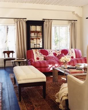
Even though I've been in the interior design industry for 8 years, I'm still incredibly interested in other designers' processes; how they begin a room design and how to they put a presentation together for a client. Because it interests me so much, I thought maybe it would interest some of you as well.

I am working with a few really great clients right now, one of which is furnishing an entire home in Newport Beach with some minor construction throughout. We had our first presentation this week, so I thought it would be fun to share those images along with a step by step of how my design process works.

Initial Meeting
The process always begins with a phone call or email where we discuss the general parameters of the project and set up our initial meeting that will take place at the job site. The first meeting is where the client and I have a chance to meet in person and essentially decide if we like each other enough to embark on the intimate journey that is designing someone's home. Some clients will hire me solely based off my portfolio, others are looking for a friendship type connection, and every client is different.

At this initial meeting I encourage the potential client to pull photos of things that inspire them or that they are drawn to. This could be anything from interiors, art, fashion, etc. We also walk through the space as they tell me how they live and what their functional needs are as a family. This is really where I begin my assessment of how my potential client uses their home. We talk about everything from their work schedule, to how they like to entertain, to when they anticipate having children, to how many nights a week they eat in or out. Are they casual or formal? Are they introverted or extroverted? Are they big TV people or are they more interested in a cozy reading corner with great lighting?

The Agreement
After our first meeting, I type up a design agreement to be signed by the client and myself. It states the scope of work and my design fee. (A note about my design fee: Small consulting jobs are generally billed at an hourly rate and we work off of a retainer. Complete room or house design is billed at a flat rate based off of the square footage of the project.) If the client decides that they want to work with me, they sign the agreement, submit the deposit, and we're off and running.

Client/Designer Meet up #2
A second meet up with the client is usually required where we set the schedule for the job and I can take photos, collect existing floor plans, or take my own measurements to work from. We decide what areas we will address first and we discuss any additional information that we didn't address at the first meeting.

Achieving a Design Direction
Now it's time to design! After taking what the client has told and shown to me, I look for that one thing that will act as the guide for the design. That one thing can be a photo of a room, a piece of art, or a swatch of fabric. Usually that one thing leads to a whole bunch of other things that begin to make up the design of the room. It's a process that evolves over the course of the next couple of weeks. I carry these pieces of fabric, wood samples, and photos around with  me everywhere, frequently staring at them for long periods of time to make sure I feel good about the design direction.


Furniture Space Plan
During this preliminary design phase, I also start working on the space plan (furniture layout). I usually do this in one sitting and create 2 or 3 options for each space. The space plan is crucial to determine what size of furniture pieces and how many are needed for the room. At this point I have a general idea of the style of furniture I want to incorporate, but I can't select the exact pieces until I know what size I'm looking for. You would be surprised at the difference 2" can make when I protrudes into a walk-way.

**Things that make a successful space plan**
-creates great conversation areas
-there is a focal point
-there is ease of access from one side of the room to the other
-the size of furniture is appropriate for the purpose of the room (deeper sofa in the TV      
        viewing room, daintier furniture frames in more formal spaces)
-the amount of furniture and its spacing fits the personality of the client and their lifestyle
        (minimalists = more open space with less accent furniture; collectors = cozier
        furniture layouts and more accent chairs, tables, and shelving)


Paring Down
To select furniture I do a combination of online shopping and showroom visits, while fabric shopping is done solely at the fabric showrooms. I have to see and feel the fabric in person to know if it will work. When all is said and done, I generally have way too many furniture, lighting, and fabric options. All of it goes well together, there is just too much of it. Clients are looking to me to give them the best design selections, not overwhelm them with 100 different options. The week before our first presentation is the time to pare down the options and start putting together the presentation board.


Presentation Board
I always put my presentations together on a cork board with push pins. If a client hates a red print that I have selected, the last thing I want is for it to be glued permanently in place. I need the ability to pin new options up, take existing options down, and swap the sofa and ottoman fabric. The items that I start with on the board are my top choices; the design that I 100% endorse and love. We start with that and then review additional options from my bag of tricks depending on how the client responds. For every selection; furniture,  fabric, and lighting, I will have at least 2 additional options to show my client.


Renderings
A colored rendering of the space plan is an absolute must when presenting a room design for the first time. Clients need to see how everything is laid out, how it flows, and get an idea of where color and pattern will be in the room. I will also include quick sketches with color (above) of certain areas of the room or wall elevations if I feel like it will help the client visualize the space better.

Feel free to check out my Pinterest board that I discussed in a previous post here, where you can see my design  journey and all of the additional selections that didn't quite make the final cut for the presentation.

Wednesday, April 18, 2012

Henri Matisse


I think art from the masters is an amazing way to identify a color palette. The texture of brush strokes and canvas can also inspire the textures of a room. Henri Matisse's masterpieces, specifically those from the Fauvism movement, are some of my favorite. The colors are so alive and remind me of spring. Time to make our way over to Paris to visit this Matisse show.

Matisse poster available here.

Thursday, April 12, 2012

Pinning Away


I'm really excited about a new client in Newport Beach. We are working on furnishings their entire home and I have found myself using Pinterest more at the start of this project than with any others that I have worked on in the past. I like that my pinned photos have links back to where I found them, which will be helpful to pull exact dimensions and obtain pricing once I have things narrowed down. I also like that I'm not taking up space on my computer with a bunch of photos that are now accessible anytime I'm online. I can't say that I am yet in need of a 12 step program for obsessive pinning, but I can't deny it's convenience for organizing images and ideas.

These are a few of the pins that I've added to my clients' board. For those of you interested in following me on Pinterest, you can find me here. I also recently added the "pin it" button to the bottom of my posts in case you see something around these parts that you want to add to your own boards!

Monday, April 9, 2012

My Easter at Home


At the last minute on Saturday night I decided to spend Easter up in my home town of Modesto, California. I hopped in my car early Sunday morning and arrived just in time for Easter dinner #1 with best friend Kelli's family, followed by Easter dinner #2 at best friend Erin's. Both were delicious and so much fun, and sometimes, even though you would never ever want to move back to your hometown, it sure is good to visit every now and again.

To call Modesto a charming little town would be more than a stretch, that's more like a bold faced lie. I didn't hate growing up here, I actually kind of liked it, but I always knew there was something more interesting out there for me. It turns out that I was right, but now that I've lived in Idaho, Utah, Orange County, and Los Angeles, I find that I still have that same feeling inside; that there is still something more interesting out there for me. Until I live or visit every place in the world, I might always feel that way, but I'm okay with that because those restless feelings encourage me to experience new people and new places that in turn give me a new perspective and make me a more well rounded person and designer.

I think if I keep my eyes open, literally and figuratively, I can find beauty everywhere. Although Modesto may not look like much from the outside, it is packed with amazing memories as well as a few really beautiful backyards. After spending some time in my friends' backyards (see photo) these past two days - eating, laughing, and picking flowers - I've been really inspired to get going on my own garden. My new apartment has a community vegetable and flower garden and I can't wait to dig in when I get back.

I'll be working remotely from my hometown for the next day or two, but in my spare time I'll be documenting moments of beauty that I stumble upon. You can follow me on Twitter and Instagram to see what I find.


Wednesday, April 4, 2012

Getting There


After finally getting over my sofa fabric debacle, my living room is starting to take shape, although we have a long way to go yet. When redoing vintage pieces, I always end up making my own modifications to make them more modern. I think with classic or designer vintage pieces, it's better just to leave as is, but if it's just a middle of the road sofa from 1970, why not do a few extra nips and tucks while it's already under the knife for re-upholstery?

My modifications to the sofa were: 

*New wood finish. The previous color was very orangy (not shown), typical of 70's furnishings.
*No more tufting. It could have stayed, but I just didn't like it for my vision of the room.
*You can't really see from the photo above, but there were wood pieces lining the top edges of the sides. It was about as weird as it sounds, so I had them shaved down and covered with fabric. 
*The sofa originally had 3 seat cushions and I made the decision to make a brand new bench cushion that was feather wrapped for extra comfort. It was a little extra money to scrap the foam in the old cushions and have a new cushion made, but it was worth it. Now the seat cushion is more uniform with the solid back, and it has that rumpled cozy look that you only get from a down-fill bench seat. I love that. 


We're getting there! At least we have seating and a couple pieces of art on the wall, and it's amazing what a bundle of blossoms will do for an unfinished room.

So far...

1. Jute rugs are more comfortable than sisal and work in just about any room. I randomly found this one for $89. Finding super deals like that frees up some of my budget to spend on more expensive upholstery fabric.

2. Santa Monica has the best farmer's market. Room changing blossoms for $6.

3. Covering my existing pillow fills with some fun patterns will really help bring the room to life. That is on my "to do" list right after drapery.

4. That mirror might be my best and most favorite thrift store find to date - it's big, made out of the perfect cream color rattan, and only cost me $8.

5. My coffee table is the first real piece furniture (that wasn't from Ikea) that I ever bought as an adult. I've had it for years, waiting for the appropriate time to put it to good use.

Tuesday, April 3, 2012

My First WestWeek


As a Southern Californian interior design, I shouldn't admit this, but this March was my first WestWeek at the Pacific Design Center. My design and business mind was expanded a hundredfold and I will be sure not miss any more future WestWeeks.

I went to hear a talk by Windsor Smith at Kravet about branding (above photo). I know that my brand and branding myself has a way to go, but with her helpful tips, I feel like we're on the right track. This is the second time I have heard Windsor Speak, the first was last July at her showhouse, The House of Windsor. I can't say enough good things about her. She's great; incredibly charismatic, fun to listen to, so friendly and approachable. It is no coincidence that a main characteristic of her brand that she spoke about, is to be approachable, not only personally, but for her designs and products to be and feel approachable for all types of clients.

I was also able to hear from the new(ish) editor of Architectural Digest, Margaret Russell on interior photography for publications. Extremely helpful. And another highlight was listening to a panel of 4 designers talk about inspiration. I often look to current designers for inspiration, as can be seen in my "Influential Designer" posts. After listening to the panel (which consisted of 2 of my other favorites, Charlotte Moss and Suzanne Kasler) I realized that I need to deepen my pool for inspiration and expand my knowledge of art and design. It makes sense that when I look to current designers, furniture makers, blogs, and trends, that I am just regurgitating what has already been done while putting my own spin on it. That is no longer good enough for me, and I don't think it's good enough for my brand.

My eyes were opened as the panel spoke about their sources for inspiration and constantly referenced the past. It makes perfect sense. When I look to the past and when I look to historic and classic figures, places, and styles, that is when I can  meet the challenge of taking something old and great, and making it new again in my very own and unique way, regardless of what everyone else is doing. It will provide me with the opportunity to be more original in my designs, while still seeking inspiration from truly inspiring sources.

The conclusion is that I need to brush up on my art history and history of architecture and design. Taking those classes in college seems like forever ago and I don't remember nearly as much as I should or wish I did. A refresher trip to Italy and Paris may be in order as well...


Tuesday, March 27, 2012

A Quick Little Teen Makeover


I've been working with the cutest family in Newport Beach on a quick little makeover project for the teenage girls' bedrooms. It was a quick face-lift and my client didn't want to spend a lot of money. The goal was to pick new paint, use what the girls already had, and pull the room together with accessories.

These before and afters aren't earth shattering by any means. Especially since my iPhone was recently stolen and all of the photos taken before rearranging furniture and painting the walls are lost (apparently I wasn't using "the cloud" correctly). But I still wanted to share the process to demonstrate what a few inexpensive accessories and fresh flowers can do to pull a room together.


This particular daughter is an artist, and a very good one at that! Her artwork that we hung beside the bed guided the color palette for selecting accent pillows, a side chair, and a fun little ottoman.


Lamps, mirrors, and pillows can be found and your local Target or HomeGoods and they're really all you need to spruce up a stale space on a tight budget.


Bulletin boards are great wall art for teen rooms. They're inexpensive and take up a lot of space and are a great place for them to hang photos and notes from friends. The cork also also adds a warmer neutral that balances out all of the white furniture. 

This particular bed has a trundle underneath; a must-have for a proper slumber party (shout out to my best friend Kelli Bravo for always having a comfy trundle for me to sleep on in elementary school). Originally there wasn't anything to the left of the bed because it would block the path of the trundle bed. It didn't make sense to me to have an off balance bed 99% of the time to accommodate the 1% of time when the trundle would be used. My solution was an inexpensive light weight pedestal table that: 1. creates balance 2. adds a little color and 3. is easy to move when necessary.

Two lamps aren't necessary to frame a twin bed, and a lamp would have been cumbersome on the small table anyway. However, fresh flowers are always necessary.

A note about the navy blue lobster and seahorse art to the left: Selecting appropriate teen artwork is to walk a very fine line. I love the youthfulness of her bedding and it's bright floral motif, but going that same direction for artwork would have been too much. Design, even for a quick teen makeover on a budget, is about balance, compromise, and harmony. The lobster and seahorse brought out the small amount of Navy in the bedding, which was a nice contrast to the all of the happier greens and pinks in the room. Also, the subject matter was perfect for a Newport Beach bedroom and at $16.99 each, I really couldn't say no.


This vanity was originally in the other daughter's room, but we brought it in here so that she could have a place to do her make up and so the other bedroom could accommodate a lounge chair. Sometimes it's just about moving around what you already have and putting it in another room or maybe just on a different wall.

The mirror connected to the vanity just wasn't doing it for me. I think the proportion of it wasn't right for the wall or the vanity itself. We detached it and used this as an opportunity to bring in more contrast and texture with a grass reed mirror. 

In the before photo you can see the corner of a white chest at the end of the bed. Again, it was too much white and very boring. I found this small rattan chest in the bathroom section of a HomeGoods. I looked in the furniture section and didn't see anything but leather type ottomans, which was a little too sophisticated for this space. Note: If you need small and interesting storage or shelving for bedrooms or small living spaces...check the bathroom section!

Related Posts Plugin for WordPress, Blogger...