Showing posts with label design projects. Show all posts

Sunday, June 3, 2012

Visual Merchandising at Fred Segal


I recently had the opportunity to help the talented Steve Jones of Better Shelter with a visual merchandising project at Ron Herman in the Fred Segal on Melrose. We were working with a vintage surf theme and some really cool authentic surf memorabilia to showcase the launch of the M. Nii line of surf apparel.

I'm definitely a fan of the collage wall aesthetic. It's not always appropriate, but I think it worked really well with this particular line of clothing that incorporated simple stripes and solids in primary colors. The simplicity of the clothing allowed for a busier display, and the collection of surf memorabilia really got the point across that this wasn't just another trendy line of surf wear.


Thursday, May 10, 2012

Freshening Up on Balboa Island


Balboa Island is one of the quaintest parts of Newport Beach. Almost every time my family comes to visit in the summer we find time to bike down to the island and take the ferry across to the peninsula. Many of the houses on the island have been remodeled and transformed into adorable beach cottages, which makes the bike ride that much more enjoyable for me as a passer-by. 


It was such a privileged to work with this particular client on their already pretty fabulous summer home. Updated traditional architectural elements were already in place and provided the perfect canvas for a little face-lift.


Somehow I never get tired of blue and white. I wonder if I didn't design so many homes along the coast if my color palette would differ more... I actually never intentionally set out to be a beach house designer and I still don't like to define myself as such, but looking back at my projects over the past few years since I've been designing on my own, most of them have resided in beach cities, and that's just fine with me. 


Afterall, if I could pick anywhere to live in the world, it would be by the beach. I have a short list of places that I want to live before I die and sure enough, most of them are coastal towns. 

A big thank you to my photographer, Stacey Sutherland, and my assistant Kelli for making these four little photos possible.

Monday, May 7, 2012

Something You May Not Know...


Something you may not know about me is that I do, in fact, love floral printed fabric. I'm not sure what it is about my branding or the vibe that I put off, but I can count on 2 fingers the number of clients that have hired me and liked floral prints. Many of my clients will go for leaves or something with the essence of nature or even stylized or abstract floral patterns, but when it comes to traditional floral prints; the ones that look like Martha Stewart's garden in pillow form, it doesn't interest them.


I know that my designs are much more contemporary than traditional, but what I enjoy most is a contemporary take on traditional elements. That sounds oh so cliche, but it's true nonetheless.

While selecting fabric for my new apartment, I had really one, no two, requirements. 1. I had to get creative with my spending and stay within a small budget, and 2. I  had to be true to myself. I wanted more than anything for my home to be a reflection of me without regard to what's trending on design blogs. I wanted it to be a space that, although small and inexpensive, I could add proudly to my portfolio to give a little more dimension to my design aesthetic.


This meant including a garden-y floral fabric as one of my main points of interest in the room. My selection was Lee Jofa's Bardstock in color Mocha (see above). It's pricey, retailing at $390 per yard. I get a designer discount, but even still...it has a hefty price tag. Unfortunately once I laid eyes on it I couldn't envision using anything else. So, going back to rule #1, "getting creative with spending", the budget didn't allow for me to upholster a large piece of furniture or drapery in my beloved floral, so instead I will be ordering the minimum order requirement of 2 yards and creating a throw for my gray sofa. Nathan Turner beautifully illustrates this concept below.


My new apartment is starting to feel like home as I fill it up with some of my favorite vintage pieces that have had reupholstered. Last week I brought home these fantastic tub chairs (see below) from the upholstery shop and they have really spiced things up. Every room needs a good stripe, afterall.


You can stay up to date with my apartment decorating and my other client projects via Twitter and Instagram!

floral fabrics shown via Carolina Irving, Robert Kime, and Lee Jofa

Friday, April 27, 2012

Finished Project: Newport Beach Kitchen


If I have any faithful readers they may remember a few posts about a kitchen in the East Bluff neighborhood of Newport Beach that we completely gutted and redesigned (see first post here). We actually completed construction about a year ago, so sharing the finished product has been a long time coming.


Kitchen remodels are quickly climbing the charts as one of my favorite types of projects. There is something about designing one of the most necessary and used rooms in a home that really interests me. It's somewhat like a puzzle and I enjoy the challenge of fitting all of the pieces together to create the most efficient and functional space possible for my client.


After a kitchen is complete and my client tells me that they have a renewed love of cooking, or that their mornings now aren't ever long enough to sit and enjoy their morning cup of tea at the breakfast table, that is when I know that the design was truly successful.


The Scoop:

counter: CaesarStone
backsplash: beveled edge brick, calacatta gold marble
stools: Ballard Designs
dining table and banquet: custom
pillows and drapery: custom
art: antique egg prints via my trip to London and eBay
framing: hand-painted in a silver metallic with a touch of bronze by yours truly
cabinetry: custom built and installed by Artisan Builders, adobe style doors
hardware: Restoration Hardware
pendant lights: Restoration Hardware
drum shaded chandelier: Visual Comfort

photography: Stacey Sutherland

Wednesday, April 25, 2012

The Design Process


Even though I've been in the interior design industry for 8 years, I'm still incredibly interested in other designers' processes; how they begin a room design and how to they put a presentation together for a client. Because it interests me so much, I thought maybe it would interest some of you as well.

I am working with a few really great clients right now, one of which is furnishing an entire home in Newport Beach with some minor construction throughout. We had our first presentation this week, so I thought it would be fun to share those images along with a step by step of how my design process works.

Initial Meeting
The process always begins with a phone call or email where we discuss the general parameters of the project and set up our initial meeting that will take place at the job site. The first meeting is where the client and I have a chance to meet in person and essentially decide if we like each other enough to embark on the intimate journey that is designing someone's home. Some clients will hire me solely based off my portfolio, others are looking for a friendship type connection, and every client is different.

At this initial meeting I encourage the potential client to pull photos of things that inspire them or that they are drawn to. This could be anything from interiors, art, fashion, etc. We also walk through the space as they tell me how they live and what their functional needs are as a family. This is really where I begin my assessment of how my potential client uses their home. We talk about everything from their work schedule, to how they like to entertain, to when they anticipate having children, to how many nights a week they eat in or out. Are they casual or formal? Are they introverted or extroverted? Are they big TV people or are they more interested in a cozy reading corner with great lighting?

The Agreement
After our first meeting, I type up a design agreement to be signed by the client and myself. It states the scope of work and my design fee. (A note about my design fee: Small consulting jobs are generally billed at an hourly rate and we work off of a retainer. Complete room or house design is billed at a flat rate based off of the square footage of the project.) If the client decides that they want to work with me, they sign the agreement, submit the deposit, and we're off and running.

Client/Designer Meet up #2
A second meet up with the client is usually required where we set the schedule for the job and I can take photos, collect existing floor plans, or take my own measurements to work from. We decide what areas we will address first and we discuss any additional information that we didn't address at the first meeting.

Achieving a Design Direction
Now it's time to design! After taking what the client has told and shown to me, I look for that one thing that will act as the guide for the design. That one thing can be a photo of a room, a piece of art, or a swatch of fabric. Usually that one thing leads to a whole bunch of other things that begin to make up the design of the room. It's a process that evolves over the course of the next couple of weeks. I carry these pieces of fabric, wood samples, and photos around with  me everywhere, frequently staring at them for long periods of time to make sure I feel good about the design direction.


Furniture Space Plan
During this preliminary design phase, I also start working on the space plan (furniture layout). I usually do this in one sitting and create 2 or 3 options for each space. The space plan is crucial to determine what size of furniture pieces and how many are needed for the room. At this point I have a general idea of the style of furniture I want to incorporate, but I can't select the exact pieces until I know what size I'm looking for. You would be surprised at the difference 2" can make when I protrudes into a walk-way.

**Things that make a successful space plan**
-creates great conversation areas
-there is a focal point
-there is ease of access from one side of the room to the other
-the size of furniture is appropriate for the purpose of the room (deeper sofa in the TV      
        viewing room, daintier furniture frames in more formal spaces)
-the amount of furniture and its spacing fits the personality of the client and their lifestyle
        (minimalists = more open space with less accent furniture; collectors = cozier
        furniture layouts and more accent chairs, tables, and shelving)


Paring Down
To select furniture I do a combination of online shopping and showroom visits, while fabric shopping is done solely at the fabric showrooms. I have to see and feel the fabric in person to know if it will work. When all is said and done, I generally have way too many furniture, lighting, and fabric options. All of it goes well together, there is just too much of it. Clients are looking to me to give them the best design selections, not overwhelm them with 100 different options. The week before our first presentation is the time to pare down the options and start putting together the presentation board.


Presentation Board
I always put my presentations together on a cork board with push pins. If a client hates a red print that I have selected, the last thing I want is for it to be glued permanently in place. I need the ability to pin new options up, take existing options down, and swap the sofa and ottoman fabric. The items that I start with on the board are my top choices; the design that I 100% endorse and love. We start with that and then review additional options from my bag of tricks depending on how the client responds. For every selection; furniture,  fabric, and lighting, I will have at least 2 additional options to show my client.


Renderings
A colored rendering of the space plan is an absolute must when presenting a room design for the first time. Clients need to see how everything is laid out, how it flows, and get an idea of where color and pattern will be in the room. I will also include quick sketches with color (above) of certain areas of the room or wall elevations if I feel like it will help the client visualize the space better.

Feel free to check out my Pinterest board that I discussed in a previous post here, where you can see my design  journey and all of the additional selections that didn't quite make the final cut for the presentation.

Thursday, April 12, 2012

Pinning Away


I'm really excited about a new client in Newport Beach. We are working on furnishings their entire home and I have found myself using Pinterest more at the start of this project than with any others that I have worked on in the past. I like that my pinned photos have links back to where I found them, which will be helpful to pull exact dimensions and obtain pricing once I have things narrowed down. I also like that I'm not taking up space on my computer with a bunch of photos that are now accessible anytime I'm online. I can't say that I am yet in need of a 12 step program for obsessive pinning, but I can't deny it's convenience for organizing images and ideas.

These are a few of the pins that I've added to my clients' board. For those of you interested in following me on Pinterest, you can find me here. I also recently added the "pin it" button to the bottom of my posts in case you see something around these parts that you want to add to your own boards!

Wednesday, April 4, 2012

Getting There


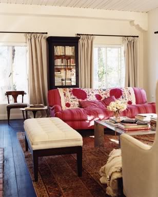
After finally getting over my sofa fabric debacle, my living room is starting to take shape, although we have a long way to go yet. When redoing vintage pieces, I always end up making my own modifications to make them more modern. I think with classic or designer vintage pieces, it's better just to leave as is, but if it's just a middle of the road sofa from 1970, why not do a few extra nips and tucks while it's already under the knife for re-upholstery?

My modifications to the sofa were: 

*New wood finish. The previous color was very orangy (not shown), typical of 70's furnishings.
*No more tufting. It could have stayed, but I just didn't like it for my vision of the room.
*You can't really see from the photo above, but there were wood pieces lining the top edges of the sides. It was about as weird as it sounds, so I had them shaved down and covered with fabric. 
*The sofa originally had 3 seat cushions and I made the decision to make a brand new bench cushion that was feather wrapped for extra comfort. It was a little extra money to scrap the foam in the old cushions and have a new cushion made, but it was worth it. Now the seat cushion is more uniform with the solid back, and it has that rumpled cozy look that you only get from a down-fill bench seat. I love that. 


We're getting there! At least we have seating and a couple pieces of art on the wall, and it's amazing what a bundle of blossoms will do for an unfinished room.

So far...

1. Jute rugs are more comfortable than sisal and work in just about any room. I randomly found this one for $89. Finding super deals like that frees up some of my budget to spend on more expensive upholstery fabric.

2. Santa Monica has the best farmer's market. Room changing blossoms for $6.

3. Covering my existing pillow fills with some fun patterns will really help bring the room to life. That is on my "to do" list right after drapery.

4. That mirror might be my best and most favorite thrift store find to date - it's big, made out of the perfect cream color rattan, and only cost me $8.

5. My coffee table is the first real piece furniture (that wasn't from Ikea) that I ever bought as an adult. I've had it for years, waiting for the appropriate time to put it to good use.

Tuesday, March 27, 2012

A Quick Little Teen Makeover


I've been working with the cutest family in Newport Beach on a quick little makeover project for the teenage girls' bedrooms. It was a quick face-lift and my client didn't want to spend a lot of money. The goal was to pick new paint, use what the girls already had, and pull the room together with accessories.

These before and afters aren't earth shattering by any means. Especially since my iPhone was recently stolen and all of the photos taken before rearranging furniture and painting the walls are lost (apparently I wasn't using "the cloud" correctly). But I still wanted to share the process to demonstrate what a few inexpensive accessories and fresh flowers can do to pull a room together.


This particular daughter is an artist, and a very good one at that! Her artwork that we hung beside the bed guided the color palette for selecting accent pillows, a side chair, and a fun little ottoman.


Lamps, mirrors, and pillows can be found and your local Target or HomeGoods and they're really all you need to spruce up a stale space on a tight budget.


Bulletin boards are great wall art for teen rooms. They're inexpensive and take up a lot of space and are a great place for them to hang photos and notes from friends. The cork also also adds a warmer neutral that balances out all of the white furniture. 

This particular bed has a trundle underneath; a must-have for a proper slumber party (shout out to my best friend Kelli Bravo for always having a comfy trundle for me to sleep on in elementary school). Originally there wasn't anything to the left of the bed because it would block the path of the trundle bed. It didn't make sense to me to have an off balance bed 99% of the time to accommodate the 1% of time when the trundle would be used. My solution was an inexpensive light weight pedestal table that: 1. creates balance 2. adds a little color and 3. is easy to move when necessary.

Two lamps aren't necessary to frame a twin bed, and a lamp would have been cumbersome on the small table anyway. However, fresh flowers are always necessary.

A note about the navy blue lobster and seahorse art to the left: Selecting appropriate teen artwork is to walk a very fine line. I love the youthfulness of her bedding and it's bright floral motif, but going that same direction for artwork would have been too much. Design, even for a quick teen makeover on a budget, is about balance, compromise, and harmony. The lobster and seahorse brought out the small amount of Navy in the bedding, which was a nice contrast to the all of the happier greens and pinks in the room. Also, the subject matter was perfect for a Newport Beach bedroom and at $16.99 each, I really couldn't say no.


This vanity was originally in the other daughter's room, but we brought it in here so that she could have a place to do her make up and so the other bedroom could accommodate a lounge chair. Sometimes it's just about moving around what you already have and putting it in another room or maybe just on a different wall.

The mirror connected to the vanity just wasn't doing it for me. I think the proportion of it wasn't right for the wall or the vanity itself. We detached it and used this as an opportunity to bring in more contrast and texture with a grass reed mirror. 

In the before photo you can see the corner of a white chest at the end of the bed. Again, it was too much white and very boring. I found this small rattan chest in the bathroom section of a HomeGoods. I looked in the furniture section and didn't see anything but leather type ottomans, which was a little too sophisticated for this space. Note: If you need small and interesting storage or shelving for bedrooms or small living spaces...check the bathroom section!

Saturday, February 4, 2012

Master Bedroom


The highlight of my week was completing this master bedroom install for one of my clients in Orange County. They aren't really the type to pick out that Navajo print used for their bed cover on their own, but that's what they have me for! They love neutrals and soothing tones, but I encouraged them to add in this one punch of color and pattern to give the room a little personality.


I love love love accessories. These small details can make or break a room. When I do an install and my client sees the room before it is properly accessorized, they are often underwhelmed. No matter how beautiful and expensive the upholstery is, or how exotic the wood on the coffee table may be...without interesting artwork and thoughtful accessories, the space feels sterile and unfinished. My number one favorite accessory if you couldn't tell from the photos above...books. My motto has become, "When in doubt, stack up some books."

I suppose my love of bookcases is probably a result of my love of books. They are such amazing avenues to display collections of anything. Built-in, leaning, open, wood, metal, you name it, I'm all about bookcases. 


I have the best clients. I love collaborating with them on their homes and designing rooms that neither of us would have come up with on our own.

Thursday, December 22, 2011

Homemade Gifts


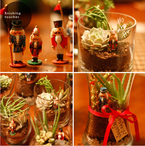
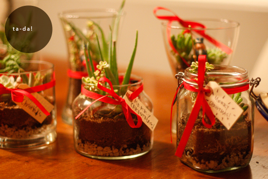
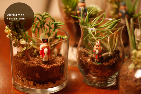
I've seen terrariums around quite a bit recently and it got me thinking about what a fun homemade gift it would make for Christmas. It seems every year that there are many people, in addition to best friends and family, for whom I want to show my love and appreciation. I decided early on that I wanted to give something a little more interesting and lasting than a plate of cookies for these special individuals. Enter the Christmas terrarium; cost effective, easy and fun to create, low maintenance, and adds a little bit of life to the receiver's home. 

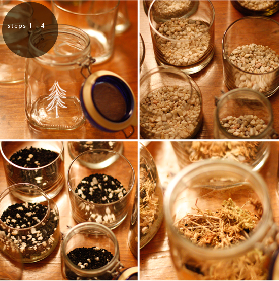
First, round up your containers. Any glass container will work, I purchased all of mine from local thrift stores. Then add a layer of coarse sand or small pebbles. This provides a drainage area to prevent overwatering. Next, sprinkle a thin coverage of active charcoal (fish tank aisle of pet store) to prevent the water from stagnating, which will cause your plants to rot (bad news). After the charcoal, add a layer of moss. The moss keeps the soil from crumbling into the pebbles. 


I purchased a variety of inexpensive succulents from Home Depot. I love the way they look and they are also really hard to kill. Finally, every good terrarium needs a kitchy figurine. These nutcrackers were perfect to give my terrariums a Christmas twist. I added tags with a personalized note and finished them off with a simple red ribbon. 


Monday, December 12, 2011

A Very Merry Giveaway!


Merry Christmas blog readers! As tempted as I was to do something completely outside the box and go for a navy and hot pink themed Christmas, I kept getting drawn to something more classic, simple, and sophisticated (see inspiration from previous post here). Anyone can easily put this table together with the below ingredients from your local craft store, but for one lucky reader, you won't have to because I'll be boxin' it up and shippin' it to ya!

I wanted to do something fun for this special time of year, so we're celebrating by doing my first ever giveaway here on the blog! To enter to win this holiday table design for 4, simply enter a comment below and tell me your favorite Christmas memory, or simply your favorite thing about this time of year. (Mine would be sailing around the Florida Keys last Christmas on a very questionable boat; that memory will definitely be hard to top.) To enter you must first leave a comment, but for additional entries you can following me on twitter here, and like my Facebook page here. I'll be selecting a winner at noon on Friday (December 16) and then packing it up and shipping it ASAP so that you have time to enjoy it before Christmas day. Sound good?


Here's what you'll get:

(4) red ribbed plate chargers
(4) smaller clear vases
(2) larger clear vases
berries, cinnamon sticks, twigs/branches
(4) gift boxes (to be filled with your own creation, personalized for your guests)
(4) red glittered initials to act as place cards and tree ornaments (I love when things serve a dual purpose...)
*Note: winner is to request the letters of their choice to coordinate with guests' names
(4) speckled feathers
twine
(1) table runner
(4) white cloth napkins

**does not include silverware, plates, goblets


Good luck and merry Christmas!!

WINNER UPDATE: I wanted the drawing to be totally fair (because a lot of times I think these types of things are rigged), so I assigned everyone a number for their comment, then you were given an additional number for a Facebook like, and an additional number for a Twitter follow. That totaled numbers 1-54. I went here and the number that came up was 23, Rebecca!!

Congrats! Let me know what glitter initials you want me to send you and I'll ship it out tomorrow! Merry Christmas!!

Tuesday, November 22, 2011

Thanksgiving Table / Flea Market Style


Happy Thanksgiving everyone! I really wanted to post up my Thanksgiving table design before Thanksgiving this year. It may only be one day early, but before is before, right? This table is brought to you by the Goldenwest swap meet. I went last Saturday morning and snatched up as much granny chic decor as I could find. I didn't really have a plan before I went, I just kept an open mind as I dug through some very questionable boxes of random linens.

When I shop, it's always more about the character and feeling of the items, rather than making sure everything matches exactly. For my florals, I went with anything that had an outdoor autumn feel in color and shape. For a finishing touch I added some cranberries and a few gourds and made placecards based on a design found here.

So there you have it.. a perfectly used, slightly messy table, with possibly a few too many vases...just how I like it.

PS Still working on this photography thing and slowly becoming willing to accept that I will never be able to be a great photographer and designer, there just aren't enough hours in the day. If anyone knows anyone who is interested in collaborating and shooting styled shoots in the OC area...give me a holler!

Saturday, October 29, 2011

Day 2


Yesterday afternoon we wrapped day 2 of shooting various design projects around Orange County. I had so much fun with my lovely photographer Stacey Sutherland and my beautiful assistant and best friend, Kelli. Thanks for a great 2 days ladies! Check back for the finished photos.

Thursday, October 27, 2011

Photo Shoot


Photo shoot days are my favorite. These are a couple behind the scenes shots from todays's shoot.

Sunday, October 23, 2011

Fall Baby Shower


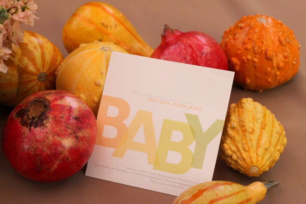
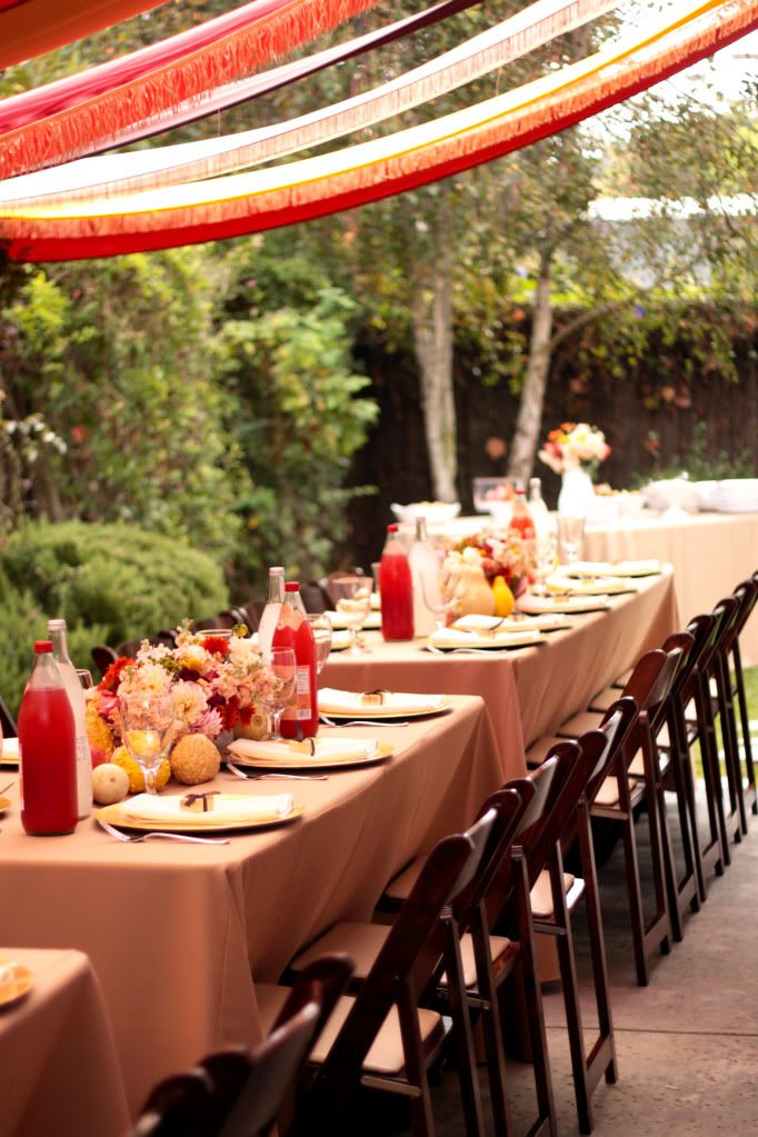
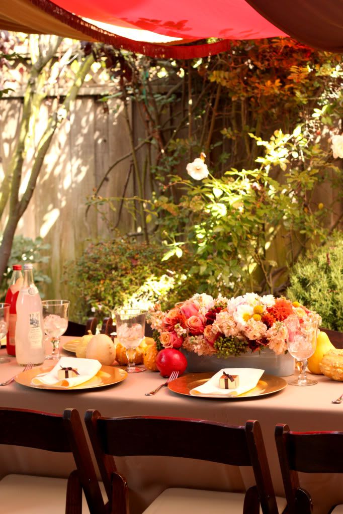
Yesterday my oldest sister and I threw a baby shower for our other sister and my first nephew. Being that it's my parents first grandchild, and just a whole new life in general, it's kind of a big deal. My sisters are my favorite people to design and decorate for. I don't know what I would do without them, so being able to impart my love of design to honor them is one of my favorite things. These are some photos from our outdoor soiree.

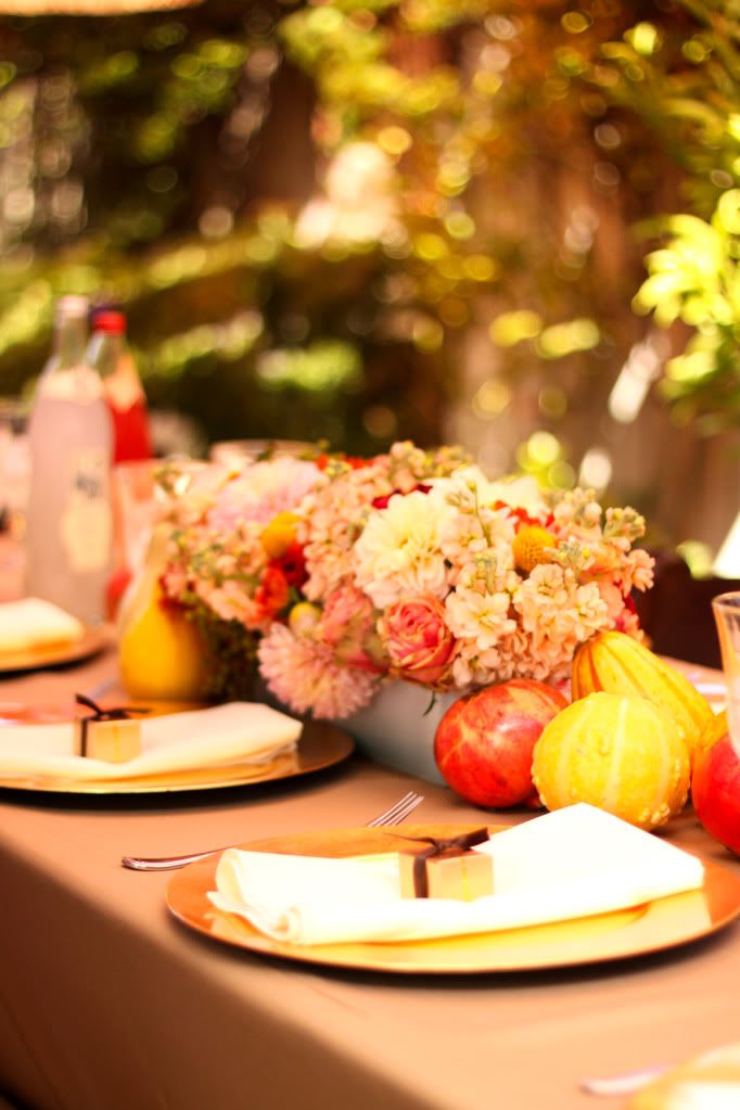
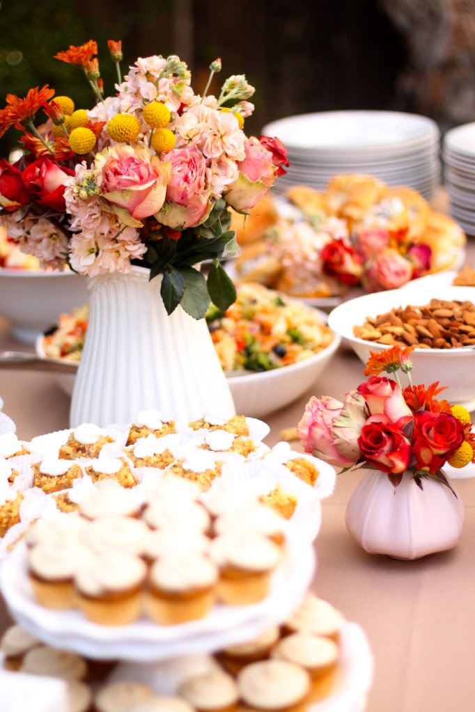
Melissa requested a fall theme (she's a bit fall obsessed and loves all things pumpkin). Since it was a baby shower I still wanted to keep it bright and pretty, so I took the yellows, browns, and oranges, and added in some cranberry and brought the whole thing together with some fall gourds, pomegranates, flower arrangements, and our homemade canopy over the patio.

How To:
  • I purchased the flowers from the wholesale mart and arranged them using floral foam in low slender containers that I found at Ikea - they were the perfect height to not block lunch conversation.
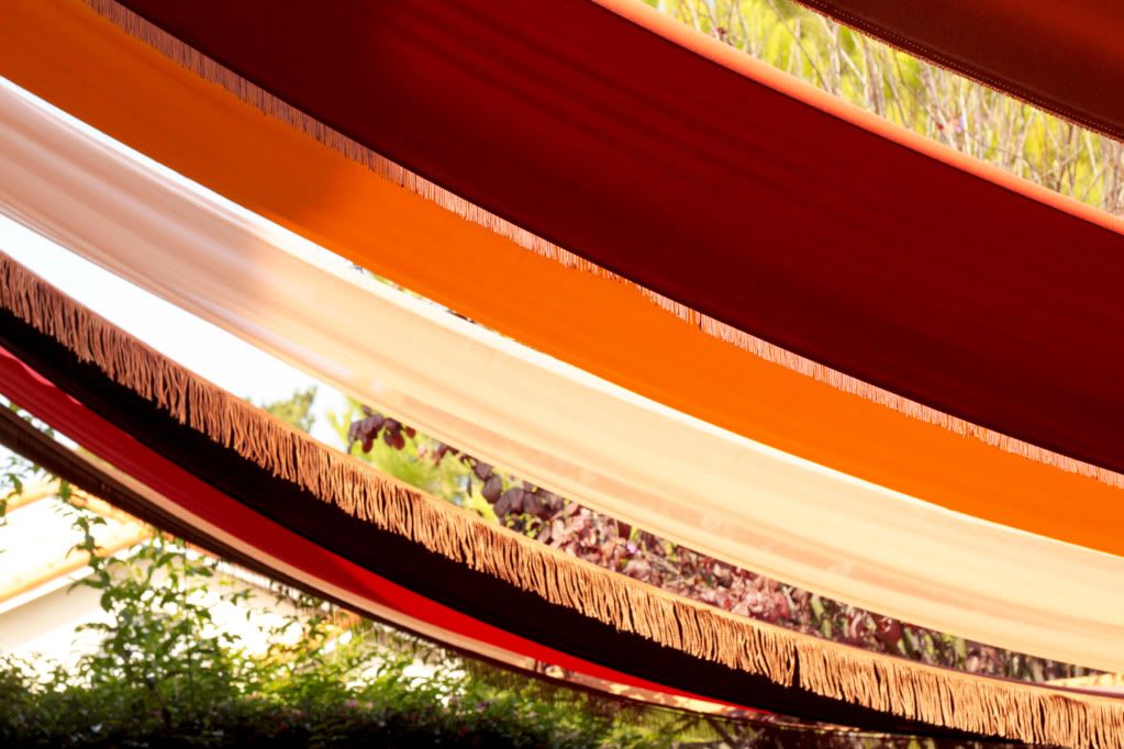
  • To create the canopy we first measured the width and length of the space. We went to the garment district in downtown LA to select our fabric. When making temporary craft projects I always use clothing fabric because it is a lot cheaper than home fabrics. We purchased each of our 6 colors for $3/yard. The length of our patio required 6 widths of 54" wide fabric so we selected 6 different colors and then split them down the middle so that each color would appear twice in the canopy. To add a little something extra we also purchased some coordinating trim. To install, I hired my brother (he works for free) to climb on the latter and hop the fence to staple the fabric to the overhang and then to the fence. It took just a couple of hours to complete and had the biggest impact on the party. It's really fun to see something that colorful in the background of all of our photos of the guests.
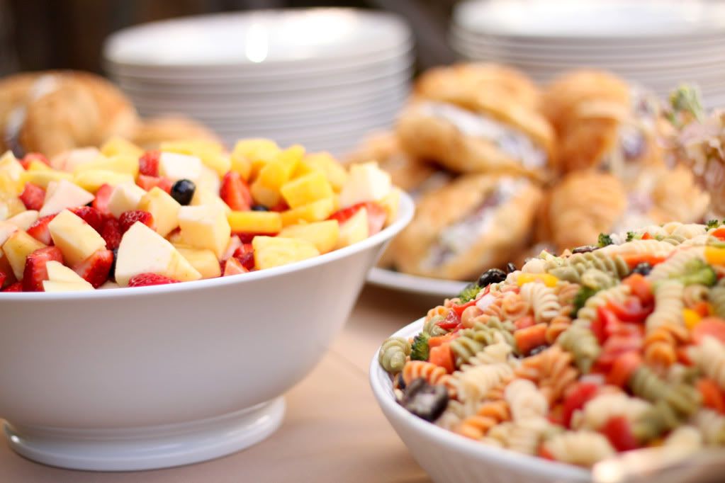
  • I find that the easiest and simplest way to make a pretty food table is to use dishes that are all the same color. White is usually my color of choice and also what is generally on hand, which saves on party costs, so it's a win-win. It also always helps to have a mom and sisters who make really pretty and delicious food. 
  • My sister purchased the gourds from Trader Joes and selected the colors that would coordinate best with the rest of the decor.
Related Posts Plugin for WordPress, Blogger...