Tuesday, March 27, 2012

A Quick Little Teen Makeover


I've been working with the cutest family in Newport Beach on a quick little makeover project for the teenage girls' bedrooms. It was a quick face-lift and my client didn't want to spend a lot of money. The goal was to pick new paint, use what the girls already had, and pull the room together with accessories.

These before and afters aren't earth shattering by any means. Especially since my iPhone was recently stolen and all of the photos taken before rearranging furniture and painting the walls are lost (apparently I wasn't using "the cloud" correctly). But I still wanted to share the process to demonstrate what a few inexpensive accessories and fresh flowers can do to pull a room together.


This particular daughter is an artist, and a very good one at that! Her artwork that we hung beside the bed guided the color palette for selecting accent pillows, a side chair, and a fun little ottoman.


Lamps, mirrors, and pillows can be found and your local Target or HomeGoods and they're really all you need to spruce up a stale space on a tight budget.


Bulletin boards are great wall art for teen rooms. They're inexpensive and take up a lot of space and are a great place for them to hang photos and notes from friends. The cork also also adds a warmer neutral that balances out all of the white furniture. 

This particular bed has a trundle underneath; a must-have for a proper slumber party (shout out to my best friend Kelli Bravo for always having a comfy trundle for me to sleep on in elementary school). Originally there wasn't anything to the left of the bed because it would block the path of the trundle bed. It didn't make sense to me to have an off balance bed 99% of the time to accommodate the 1% of time when the trundle would be used. My solution was an inexpensive light weight pedestal table that: 1. creates balance 2. adds a little color and 3. is easy to move when necessary.

Two lamps aren't necessary to frame a twin bed, and a lamp would have been cumbersome on the small table anyway. However, fresh flowers are always necessary.

A note about the navy blue lobster and seahorse art to the left: Selecting appropriate teen artwork is to walk a very fine line. I love the youthfulness of her bedding and it's bright floral motif, but going that same direction for artwork would have been too much. Design, even for a quick teen makeover on a budget, is about balance, compromise, and harmony. The lobster and seahorse brought out the small amount of Navy in the bedding, which was a nice contrast to the all of the happier greens and pinks in the room. Also, the subject matter was perfect for a Newport Beach bedroom and at $16.99 each, I really couldn't say no.


This vanity was originally in the other daughter's room, but we brought it in here so that she could have a place to do her make up and so the other bedroom could accommodate a lounge chair. Sometimes it's just about moving around what you already have and putting it in another room or maybe just on a different wall.

The mirror connected to the vanity just wasn't doing it for me. I think the proportion of it wasn't right for the wall or the vanity itself. We detached it and used this as an opportunity to bring in more contrast and texture with a grass reed mirror. 

In the before photo you can see the corner of a white chest at the end of the bed. Again, it was too much white and very boring. I found this small rattan chest in the bathroom section of a HomeGoods. I looked in the furniture section and didn't see anything but leather type ottomans, which was a little too sophisticated for this space. Note: If you need small and interesting storage or shelving for bedrooms or small living spaces...check the bathroom section!

Wednesday, March 14, 2012

Influencial Designer: Mona Hajj


On the night of February 28th I was cruising around a few different websites to see what was going on in the design scene to mark my calendar for upcoming events that I wanted to attend. My heart sank when I realized that Mona Hajj had been in Los Angeles at Rose Tarlow's showroom that very night and I had missed it. She was speaking about the last decade of her work and discussing before and after photos. I'm sure it was amazing and I can't believe I missed it.

I first took note of Mona's work when she was featured in the June 2006 issue of House Beautiful (shown below), the "Giants of Design" issue. That issue of House Beautiful was really significant for me in that it changed the way that I looked at interiors and what kind of designer I wanted to become. It really opened my eyes to the kind of amazing rooms that designers were creating. I hadn't started my own business yet, but it's quite possible that that single issue was the start of it all.


Mona Hajj has a traditional aesthetic, but you'll notice that all of her interiors still have a contemporary feel to them, which I love. I think walking that fine line between traditional and current is a really difficult thing to accomplish, but she does it with such grace and perfection. She creates warm, timeless interiors, that are free from the latest trends and ubiquitous geometric fabric patterns.

Mona, next time you come to town to speak, I'll be there in the front row.

Tuesday, March 13, 2012


On every monthly calendar I make room for the Venice Beach flea market. I love its small size and convenience. I've scored some fun treasures there in the past and Saturday was no exception. I have this growing love for hand-made, imperfect ceramics, so those two little pots ($2 each) were a perfect addition to my growing collection. 

I was torn about the lamp, it's kind of rusty and looks super granny, but the more I look at it, in all it's shadeless glory sitting on my desk, the more I like it. I need to do a little research on a remedy for rusty brass though.

You can never go wrong with a simple drawing. They fit such a wide variety of interiors. I'm going to have this one re-matted in an off-white, it will give the piece a much cleaner, more contemporary look. I was drawn to the red ink that the artist used and the frame is also really pretty and in great shape.
(side note: The proper color matting makes such an impact on a piece of artwork. To re-mat this particular piece it will be about $10 at a mom and pop frame shop. So worth it.)

Giant brass shells. Enough said. 

I'm gearing up for my second One Kings Lane tastemaker tag sale! It will take place on June 1, 2012. I've been accumulating so much great stuff to sell; this is just a little snipit and I'll continue to share little glimpses up until the time of the sale. However, the line between collecting for One Kings Lane and collecting for my new aparment has become very blurred. Now that I'm accessorizing with some of my One Kings Lane inventory, I'm going to have a harder time parting with it. It's a problem.

Friday, March 9, 2012

Me? Indecisive?


I seem to have run into a little problem while attempting to make design decisions for my new apartment. When I design for clients they give me a jumping off point, whether it's a specific style they like, or certain colors that they can and can't live with. When designing for myself, my jumping off point is...anything I've ever seen and loved, and that is not a short list. I've purposely exposed myself and opened my heart and mind to all types of styles and all color palettes so that I can be the best designer possible for my clients. But when it comes to designing for myself that just means one thing, I can't make up my mind. 

So when it came time to select a sofa fabric, I scowered the fabric district in downtown LA and all of the fabric outlets I know of in Orange County and finally settled on a lovely brown linen. It was a pretty, mocha/gray/brown, but it was still brown. When I came to my senses I called up my best design friend Nathan and asked him why, why out of all the amazing colors out there, when I could finally pick anything I want, I chose brown? We came up with one main reason: I love too many colors, so brown was an escape from having to choose among them and commit to just one. (This sounds like a metaphor for my love life, and let me tell ya...that aint a pretty situation). 

Every time I see a pink sofa in a room my heart skips a beat. (Yes, I realize it's just a piece of furniture.) And pink is probably my favorite color if I absolutely had to choose. So when I abandoned the brown linen, I kept trying to visualize my home with a pink sofa. I love the photo above from Lonny Magazine. It uses pink but in a setting that's not too frilly or girly and feels very "me". The problem I ran in to when I thought about having a pink sofa, was that my coffee table (that I purchased long ago) is white and I have a lot of vintage blue/green bottles and jars that I'll be using to accessorize, and the thought of pink, white, and bluish green felt too feminine for what I wanted my home to be. 


images left, right

Windsor Smith (interiors shown above), a designer who I admire so much, uses this color palate often. I love her interiors, but yes, the ones with this color combo do have a very feminine feel. I love to look at these interiors and it would be so fun to design something like this for a client, but in the end it didn't entirely feel like it fit my personality.

So what did I finally decide on?


...brown's hipper, more sophisticated cousin, gray. I know, super exciting right? In the end, it just made the most sense with the other pieces of furniture that I already own. If I was starting completely from scratch, things might be a little different, but my poor friend Carly has been looking at this for two weeks...


So it was time to make a decision so that we have a place to sit. I'll probably still infuse pink in to the room with pillows and flowers, but it won't be so obvious. And I'm going to continue with the blue/green and use that for drapery. Here's a little break down of what I have so far...


As I was doing this on my own, I started to realize that this is one of the reasons why people with a good design sense still sometimes hire a designer. Sometimes it's helpful to have someone to bounce ideas off of and give a second opinion, and in the end help you pull the trigger on a sofa fabric. 


Wednesday, March 7, 2012

Public Speaking Debut


Two weeks ago I had the opportunity to talk to some high school aged girls that a friend of mine teaches at church. I'll admit when she asked me, I was actually really excited; an opportunity to speak about my all time favorite subject to a captive audience of young impressionable minds! Yes, it's true, I can talk about furniture, fabric, and architecture 24 hours a day, but I knew I had to keep things short and interesting to keep a 16 year old's attention on a Saturday. I thought back to when I was their age and I knew there were two things that were a must: lots of visual aids, and a gift for them to take home (because, let's be honest, everyone loves free stuff, even if they have no intention of putting it to use).


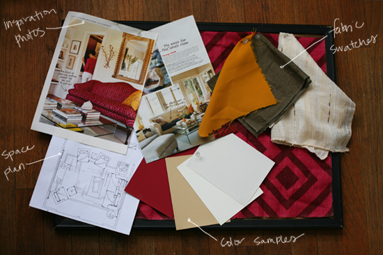
I wanted to put together an inspiration board to give them an idea of how they can use something like this as their guide when decorating their own rooms. One of my favorite interiors when I was first developing my aesthetic, and that I still love to this day is Ruthie Sommers' Santa Monica home that was featured in the premiere issue of Domino Magazine. It is an interior that most designers, bloggers, and pinterest users are all too familiar with. However, I knew it would be new to the girls so I thought it would be a fun room to use as a guide for my inspiration board. Also on the board I pinned up fabric and paint swatches that help define the color palate and overall feel, along with a scaled space plan of a living room. 


I gave them this little decorating kit to use for their own space. It included a cork board and pins so that they can create their own inspiration board, a folder to hold images and drawings, a notebook to jot down ideas and sketches, graph paper to create a basic scaled drawing of their room and furniture, and of course, a tape measure to help them create their space plan and to also take with them when bargain hunting around town. All of these things are necessary for me to organize my thoughts when working on a project of the largest or smallest scale, and I think they apply just as much to a teenage girl decorating her room.


One thing that I really wanted to focus on with the girls was the importance of accessories. If they didn't have the time, patience, or money to purchase or DIY themselves some new furniture, I wanted to stress the huge impact that even one vase of flowers or one killer piece of thrift store artwork can have on a plain space. I brought a lot of random accessories with me that I have collected over the years. I wanted everything that I brought with me to be around or under $10 so that the girls could see how accessible this was for them to do if they wanted to put forth a little bit of effort. I shared with them the price and where I purchased each item to get their wheels turning.


I emphasized simple but interesting and personal things that they could do with accessories. Some of these ideas were: use an old bottle as a vase and fill it with a couple of fresh picked daisies, fill a bowl or jar with a collection of something small such as seashells or spools of thread, create a piece of artwork by gluing rocks/buttons/paperclips onto a plain white sheet of paper and framing it with a ready-made shadow box frame. 

I tried to keep things simple and wanted to give the girls tips and resources that I thought would be applicable to them and their budget. I followed this outline during our little talk and gave each of the girls a copy. It has websites, shops, and ideas that I hope they, and you, find helpful!

Sunday, March 4, 2012

A Rock Collection


Sometimes I collect things, and sometimes I just buy a collection of things. Yesterday, I bought a collection of rocks (see photo above). It wasn't planned and I'm not sure what came over me to make me purchase 50 rocks, but I did. I think part of it might have to do with the fact that I need more than just photos of pretty interiors as inspiration. The Internet has a way of making something so accessible and everywhere that it's not special anymore, such as photos of beautiful and interesting interiors. Back in the day (5 or so years ago?) I would get so excited to find a new, cool site featuring interiors of all different styles. Now I go days without looking at photos online because if I do it too often they all start to look the same, and the novelty of the experience wore off long ago.

I still get incredibly giddy when my design magazines come in the mail. It was the first thing I remembered to change my address for when I moved. The features in Veranda, House Beautiful, Elle Decor, Architectural Digest, etc., and their every 6 weeks delivery date are still special to me, and I still pick apart those rooms and analyze every detail and read every word, while photos on the Internet have become something that I scroll through at warped speeds just to try and get through it all.

Back to the rocks. I think when I got bored of looking at interior photos I started to seek inspiration elsewhere. I feel that is such an important thing for a designer, so I really have the fire-hose that is the Internet to thank. I started visiting more museums and my interest in all kinds of art increased. I started traveling more and taking inspiration from the architecture, fashion, and lifestyle of each place I visit. And I've started to find inspiration in the smallest forms and look at everything with a new and more scrutinizing eye.

So when I saw a giant table at the Goldenwest Swap meet yesterday, full of rocks, I had to stop. Color, shape, texture, form...these little guys had it all and I was instantly inspired. I spent a a good chunk of time curating my collection from the massive pile, and just like that...I became a rock collector.


I like the idea of putting the rocks on display. They need to be seen from all sides to be fully appreciated. I might actually frame a few groupings, but I also want to use a brass leaded glass box to display them on my bookcase or coffee table. These vintage models are so much less expensive than modern day versions. These were in the $20 range found here and here on Etsy.

Dining Room Chairs


I had seen these chairs around and always loved the eiffel base. While I like to keep my interiors, especially my own personal space, interesting and unique, I decided I didn't care if the "Danish modern table with the white plastic modern chairs" was completely overdone - it's a great look that I love, so I did it anyway. Not to mention that those chairs are a steal. I purchased them from this eBay seller.


We now have a place to eat, which, let's be honest, is the most important thing. My little dining room still needs artwork and window treatments, and possibly a rug, so there will be more posts to follow. On that wall behind my table that is shown in the photo at top, I've decided that I want to do an oversized custom bulletin board like my good friend Thomas O'Brien. He did a complete post about it here, (photos shown directly above). I love collecting and displaying ideas, which is why I keep this blog, and I've mentioned before that I have always kept bulletin boards around. But I think putting a giant one in the dining area for all to see will really make it a piece of interesting art that I can and will add to over time.

Related Posts Plugin for WordPress, Blogger...