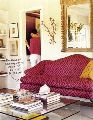
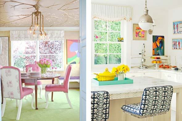
I looked through March's House Beautiful a while ago and noticed that it featured Ruthie Sommers' newly remodeled home in Los Angeles. I was a big fan of her store, Chapman Radcliff, that was on La Cienega, and like the rest of the design world, fell in love her style after her feature in the first ever issue of Domino (below).
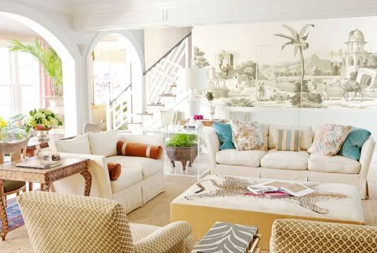
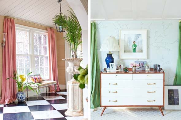
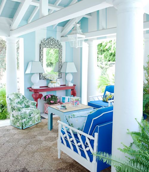
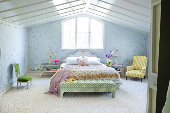
When I first became interested in interiors, I had a very white/neutral design aesthetic. Looking back, I'd have to say that Ruthie's interiors are probably one of the main things that opened my eyes to the world of color, so it is fitting that her House Beautiful article is all about her bold color choices.
It wasn't until just this past week that I actually read the article in House Beautiful and it was by far my most favorite interview to date (although I don't read every article). I was cracking up at some of her answers to the interview questions. Her honesty is refreshing and I ate up every word. Below are some of the highlights (via House Beautiful), exemplifying her extreme confidence in being who she is as a designer.
David A. Keeps: How do you make three or four colors in a room work?
Ruthie Sommers: Matching is for amateurs. That's Decorating 101. I like all colors — soft, light, shimmery, deep. I'm a watercolorist, and one thing I learned from painting landscapes is that if you're ever stuck, lighten your lights and darken your darks to create contrast.
Almost all your ceilings are vividly colored. What's wrong with white?
White is boring on a ceiling. I may not know where my car keys are, but I know when I need a yellow ceiling.
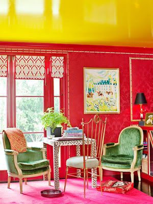
So why did your red room need a yellow ceiling?
I wanted it to feel like a lush old English study, or a cozy room in a Paris B&B, so I put red damask on the walls. But the room needed an edge. So I did a canary yellow ceiling. One person said it looked like McDonald's. I told them they needed to leave.
How can you be so confident about such bold choices?
I don't think about it too much. You know, Sister Parish never used a tape measure. I don't use a color wheel. I probably should use one more often. But when you do what you love, sometimes you can pull it off. There are a lot of clients for whom I do minimal colors or soothing ocean shades. And I don't want them to come to my house. It's not their cup of Crayolas.
You're really cuckoo for color.
It gives me a panic attack when I can't get the right color. At a client's house we painted the bathroom periwinkle, and one day we looked at the sky and it was the exact same color. I would choose seeing that over winning the lottery or sex. It tickled me pink.
A good expression.
But sometimes I'll come in here and think, 'I just want to throw this house in the ocean. Why is it so wacky?'
Don't be so hard on yourself, missy.
I have Chinese, Indian, Queen Anne, Victorian, midcentury, Georgian scroll, Greek key.... I'm envious when I go into people's houses and see their restraint. I wish I were a die-hard one-style person, but I am way too ADD.
How do you draw the line between decorated and overdecorated?
I'm sure I'm overdecorated. But I want visual candy, and it's my house, so who cares? When I can't decorate anymore, I go to the ceiling. It's the fifth wall.
What's your idea of a design mishap?
People with too much money buying things just for show. If you put in your home what you love, the bravado with which you do it outweighs any kind of provenance.
What do you consider a luxury?
Rearranging furniture all night with some great red wine. And my own tail number on a private plane.
Tufting: Terrific or tired?
No design detail gets tired to me. Tufted has never gone out, and people who say it has are paying too much attention to blogs.
What are you 'over'?
I'm over the idea that a decorator is anything more than a decorator. You sit on the floor with clients, talk about chairs, push fabrics. Lifestyle architect? Tastemaker? Please. If you have taste you never even say the word!
images via Simply Seleta, Love Forever, Coco & Emma, & House Beautiful
7 years ago



No comments:
Post a Comment