Sunday, February 27, 2011

Vintage Clocks

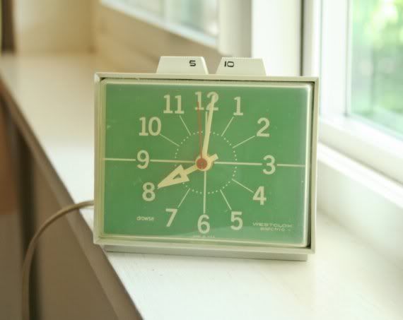
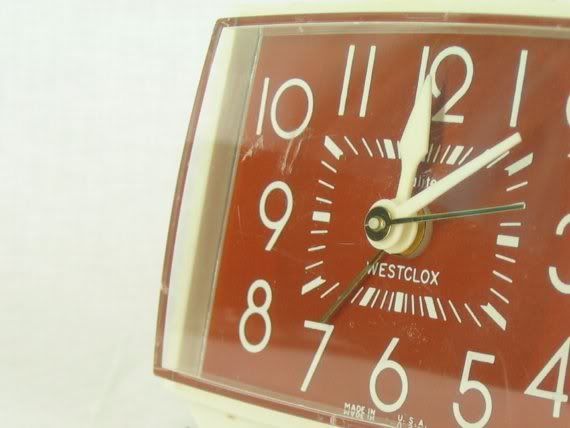
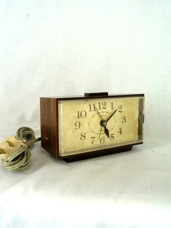
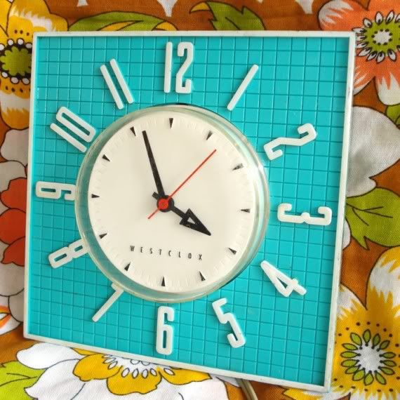
I'm working with a client who has specifically requested a clock somewhere in their family room design. It got me thinking about what a cool and functional accessory a clock can be. Although these are a bit too retro for that particular project, I'm loving these vintage Westclox clocks that I came across during my hunt.


Wednesday, February 23, 2011

Kelly Wearstler - Ready to Wear Collection

I'm back from Europe and can't wait to post about some of my highlights from Paris & London. Until I get a chance to upload my many photos, I wanted to share a look into Kelly Wearstler's new ready to wear clothing line. That's right, K. Dub is taking her modern-glam-retro interior style to fashion design and I kind of love it.

Photobucket
Photobucket
Photobucket
Photobucket
Photobucket
Photobucket
Photobucket
Photobucket

Just when I start to ask myself, is there anything this woman doesn't do? She's here with a new fabulous clothing line to remind us that...no, no there isn't.

Check out Kelly's new blog, My Vibe My Life. One of my favorite parts about the blog craze is getting to see behind the scenes and inside the creative minds of some of my favorite designers. As I read and study the photos, I find myself learning a lot and being extremely inspired.

images via Curbed.

Friday, February 11, 2011

Float

Today is a busy busy day for me. I have to tie up lose ends on some of my projects and also pack and get ready for my trip before I head up to Northern California tomorrow morning (I'm flying out of San Francisco with my parents and Kelli Monday morning). So that doesn't leave me much time for a real in depth post, but a friend of mine shared this trailer for the Float Documentary on FB and I wanted to share it with you. Such a beautiful trailer and such beautiful little planes.


PS Mom, if these little non-motorized planes can stay in the air for half an hour, then I'm sure we'll be just fine flying to Paris with our plane that has a high powered engine. (She gets a little nervous about flying.)

www.BrittanyStiles.com

Wednesday, February 9, 2011

Edith Piaf

Getting ready for my Paris/London trip by listening to a little Edith Piaf while I draw some elevations for a client. She's amazing. I think you might be able to design a whole house inspired by her music. It has also been suggested by 2 different friends of mine that I go to the cemetery where Edith and others are buried. Apparently architecturally and visually speaking it's pretty fantastic. I'll have to add it to the list.

La Vie En Rose


Non, Je ne regrette rien


Padam Padam


www.BrittanyStiles.com

French Pole

Photobucket

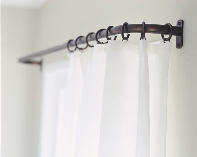
Yes, I am dedicating an entire post to my favorite kind of drapery hardware, the French pole. I think this is appropriate considering my upcoming trip to Paris (in just 6 days!). At my first design job, we always used extremely decorative drapery poles with big leaf or scrolly finials. Of course all of that has a time and a place, but my personal preference is clean, simple, beautiful drapery hardware. And if there is one type of drapery hardware that encompasses all of those, it would be the French pole. I love that there are no loose ends, and that the pole returns back to the wall creating one cohesive unit. When I started my own design company and began exploring new types of drapery hardware, I would see this style in magazine pages everywhere, but when I would to go showrooms and look online, I couldn't seem to find it anywhere. It took me quite some time to track down the French pole, but once I found out that that was its name, it made my search much easier.

Above from the Bradley Collection, below from Hesler Brothers.

Photobucket

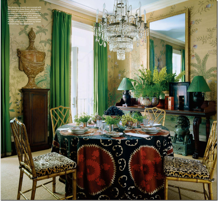
Below is a beautiful interior using a gold French pole from one of my favorites, Miles Redd (via Cote de Texas).

Photobucket

Au revoir!

Other "French" things that I love:
*French toast at Side Street on Newport Blvd. in Costa Mesa. Hands down, best French toast you will ever eat.
*French fries. Anywhere, anytime, smothered in ketchup.


Contact Brittany Stiles Interior Design if you would like assistance with window treatment and drapery design. www.BrittanyStiles.com

Saturday, February 5, 2011

Emmersonmade

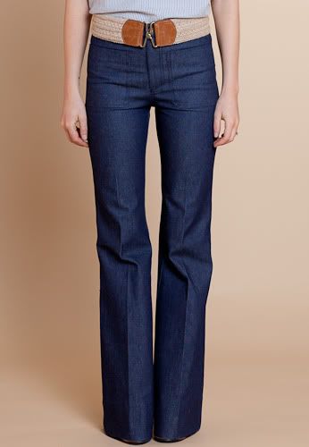
After staring longingly at Emmersonmade's new spring line for the past couple of weeks, I have decided that I no longer want these clothes. I need them. Really, I do.


www.BrittanyStiles.com

Friday, February 4, 2011

Zig to the Zag


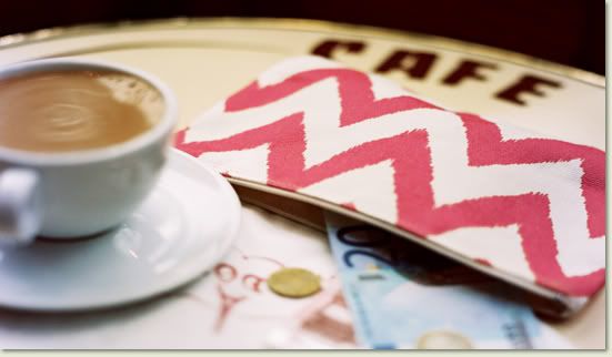
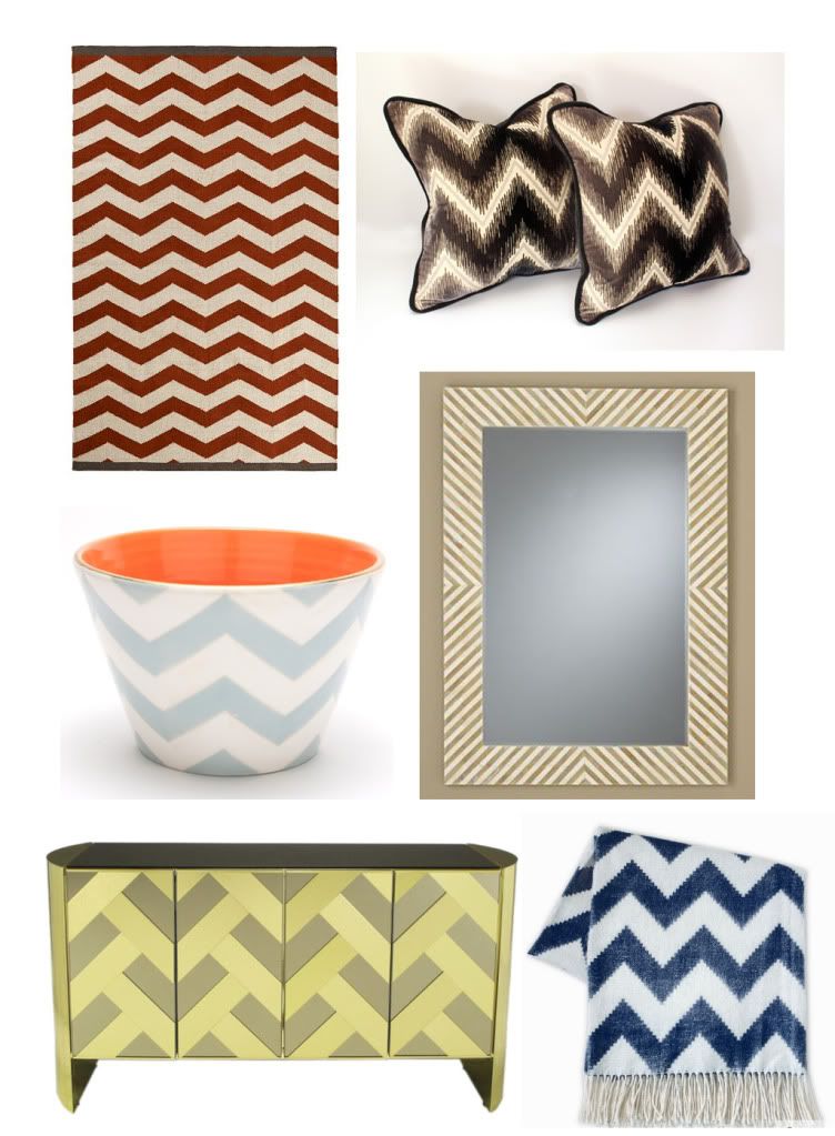
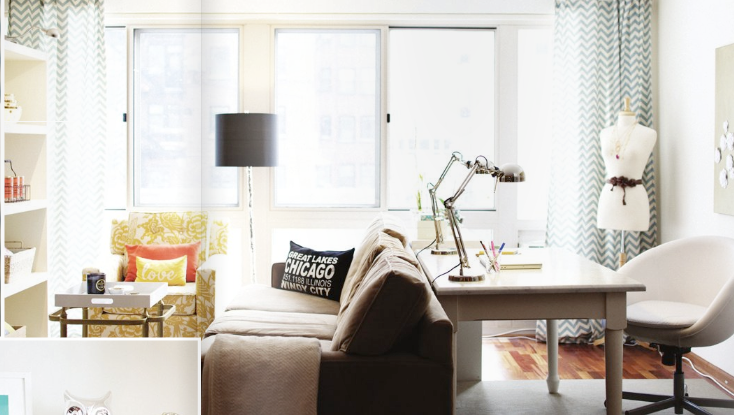
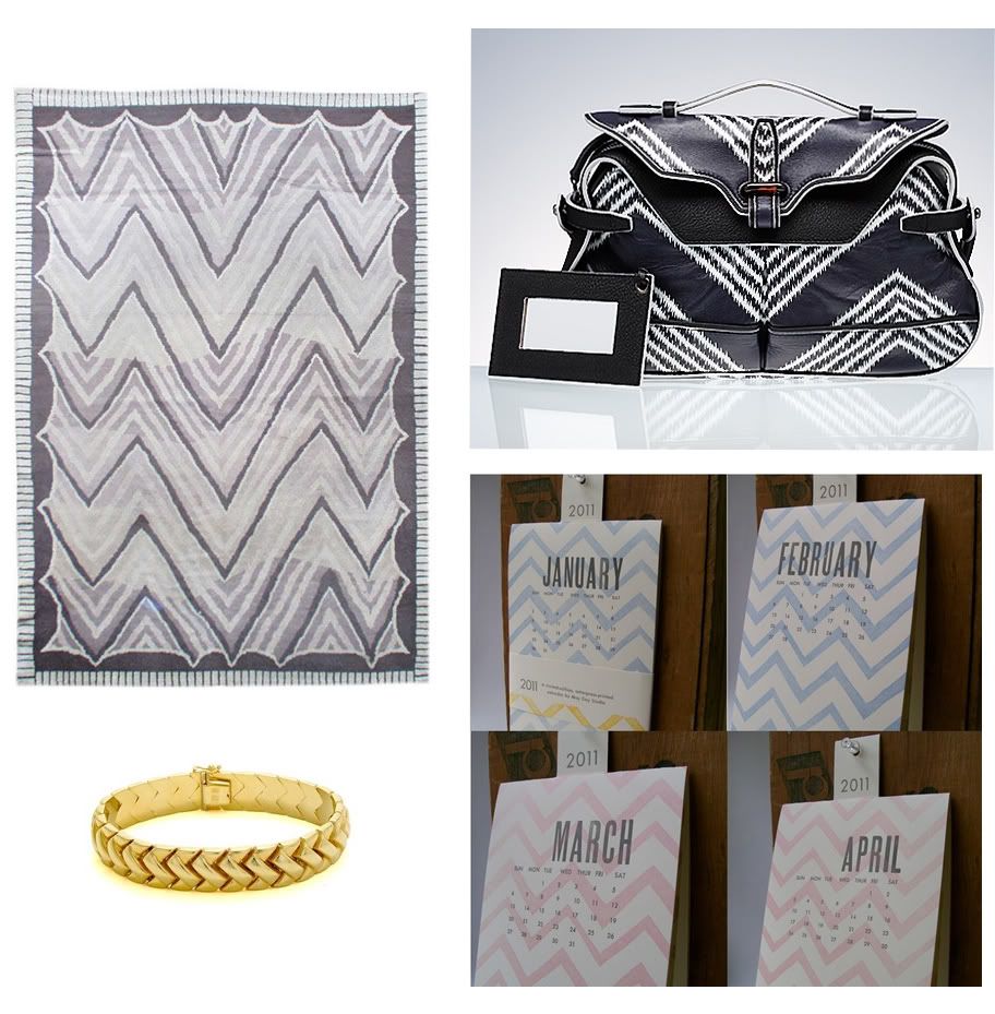
I'm probably about the millionth person to blog about the ubiquitous chevron pattern, but I can't help myself. There are certain patterns or design trends that I see everywhere and grow so tired of (e.g. Kelly Wearstler's Imperial Trellis), but no matter how many chevron patterns I see, I still think they are interesting and beautiful and I love to see the many different ways that this pattern is applied to a wide variety of furnishings and fashion. Here is a little collection of my favorite zigzags.


photos top to bottom, left to right via: Rubie Green, West Elm, The Furbish Theory, Orange and Pear, Pottery Barn Mirror found at The Elegant in the Room, Assemblage via 1st Dibs, Jonathan Adler via If The Lamp Shade Fits, Plush Studio via Rue Magazine, Doris Leslie Blau via 1st Dibs, Balenciaga, Jewel Basket, may day studio

www.BrittanyStiles.com

Wednesday, February 2, 2011

Beach House Face Lift


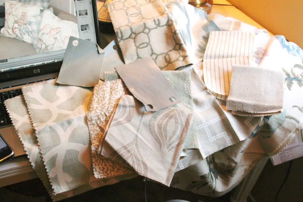
This is what my desk looks like when I'm in the middle of helping a client update her beach house. I think I'm a little pattern obsessed. Now I'm just trying to figure out if that's a good thing or not.

Tuesday, February 1, 2011

Google Street View Technology + Art

Nothing will ever beat a first hand experience, but this is still pretty cool. If anything, it can give you a little preview to see what exhibits you would actually be interested in visiting in person.


Find out more at Artinfo.

www.BrittanyStiles.com

American Modern


I mentioned a few posts ago that I was going to hear Thomas O'Brien speak at the LA Mart. He was there to talk about his book, American Modern. I wasn't originally planning on purchasing a copy, but after hearing him speak while looking at his amazing rooms on the big screen, I couldn't help myself. I've only had the book for a little over a week and I've already read it cover to cover and used it for design inspiration for a project I'm working on, so I'd say it was a good little purchase.

Thomas O'Brien is amazing. He's incredibly talented and was so genuine to listen to. I adore him.

Here's a couple of things that I have learned from Mr. O'Brien and his book.


Collect

When he was going through the different interiors in his book, he kept emphasizing this idea of collecting. Your home should be a collection of things that you love. Whether you've collected something over the years, or you've collected accessories and art specifically to redecorate your home, you should collect items that you love or that have meaning to you. I think the depth of this idea really shows in his interiors. His rooms feel very personal; not like someone just went over to the Crate & Barrel and picked up a few random knick knacks to fill up a shelf (guilty!).


Thomas purchased his home on Long Island, which was a boys school in the 1833 known as The Academy, then in 1921 it was purhcased and turned into a residence by a poet named Anne Lloyd. Thomas likes to collect coins and other memorabilia from these 2 different years, along with Anne Lloyd's published works, to fill the tables and shelves in his home.


It's ok to make your own rules, as long as you make it look good.

Thomas O'Brien installed custom Venetian blinds that were taped and corded in his New York apartment many years ago, and now he says they are a preferred treatment to do for clients. I was always taught that Venetian blinds were a no no. And if you flip through any design magazine nowadays, you most likely won't find them on any page or in any interior. But I have to admit, that Thomas makes them look so good. They fit his interiors perfectly. He says in his book, "I love the retro, reading-room feel of them, the elegance of their function." Amen. No one can argue that when it comes to function, Venetian blinds are where it's at in terms of window treatments, but of course, there is a time and place.


Homes are meant to be lived in.

Clients everywhere (mine as well as Thomas') worry about stains on light colored fabric and furniture, scratches and wear on marble counter tops, and nicks in wood flooring. Thomas addressed this issue during his presentation when someone asked how he convinces his clients to use these types of materials. His answer was basically that everything is destructible, you live in these spaces, you use these items, that is the point of having them. Wear and tear shouldn't keep you from designing and living in a beautiful home, or living in that home once it is completed. Furniture will need cleaning and counter tops may need resealing and resurfacing from time to time, but that is part of the natural upkeep of your home, like changing the oil in your car, or taking a shirt to the cleaners. And if you never get around to that upkeep, Thomas O'Brien shows you how the lived in look can be so beautiful.

Many people would shy away from white painted floors, but Thomas loves them. He said he just slaps a new coat of paint on them every couple of years to keep them looking fresh.


I don't think I saw any other surfaces other than butcher block or marble in his kitchens and bathrooms. You really can't beat the aesthetic beauty of marble, even with a few scratches.


photos via habitually chic, nest egg, design sponge, four walls and a roof

www.BrittanyStiles.com
Related Posts Plugin for WordPress, Blogger...