Wednesday, March 30, 2011

Suzanne Rheinstein @ Laguna Design Center

I've had a little thing for Suzanne Rheinstein ever since I met my good friend Joanna while working at my first interior design job in Laguna Beach as an assistant. Joanna has such an eye for design and had the privilege of working for some really fabulous designers before retiring from the biz a couple of years ago. Suzanne Rheinstein just happened to be one of those designers and I always loved to listen to Joanna talk about her days working for Suzanne.

Photobucket

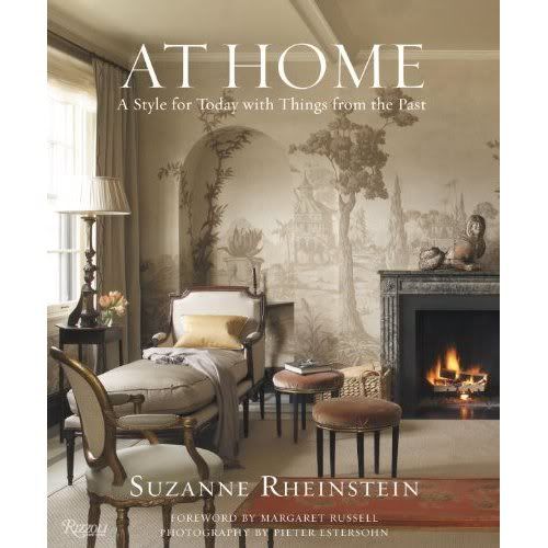
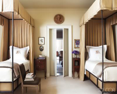
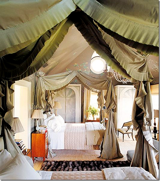
Last week I was able to hear Suzanne speak at the Laguna Design Center Market and it was fabulous. She kept her talk relatively short, but it was informative and got me thinking about design from a different perspective (something I love most about listening to other designers who have made their mark on the design world). She was promoting her new book, At Home: A Style for Today with Things from the Past, and as she went from page to page she talked about how the small details in a room or on a piece of furniture are what really make a fabulous, interesting, and thoughtful interior. These details emerge in Suzanne's designs by way of custom embroidery, beaded trim, pleating, tassels, ruching....the list goes on.

Photobucket

Photobucket

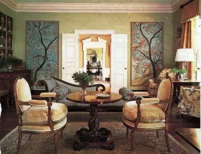
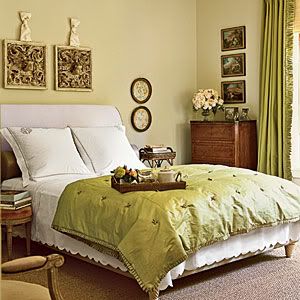
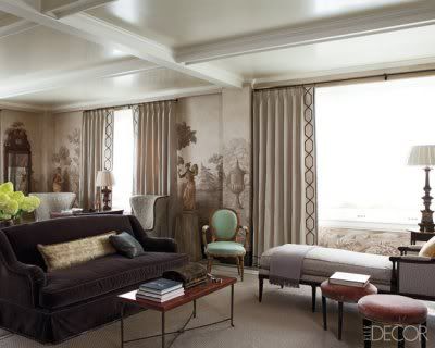
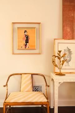
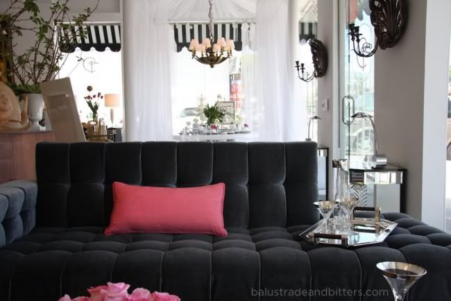
When designing for a budget conscious client, these details are generally the first to go, but Suzanne made a great case for why the "details" should stay. If you take a look at some of her interiors you will notice that this attention to small but significant details is always present.

Photobucket

Photobucket

Suzanne is an amazingly talented designer with a lot of depth and an incredible eye for antiques and how to incorporate them heavily into an interior while still keeping the space current. I may even go so far as to use the term "timeless".

Photobucket

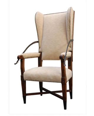
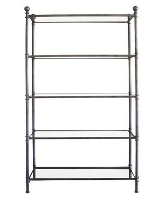
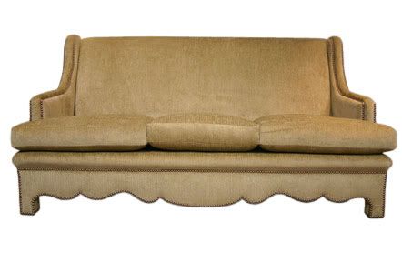
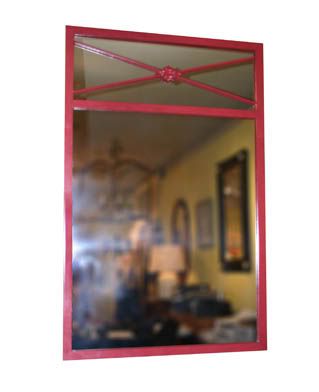
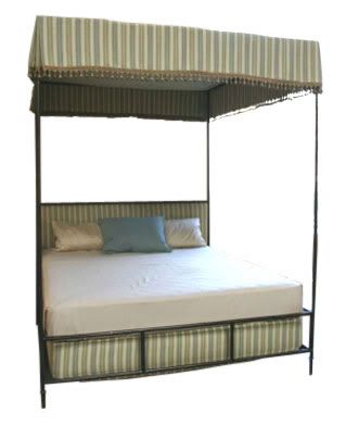
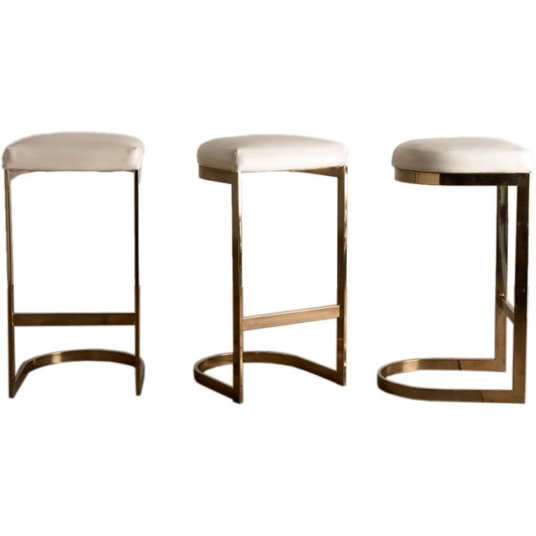
You can take a little piece of Suzanne Rheinstein home with you by shopping at her well-known LA shop, Hollyhock. Below are some furnishings from her shop that I love.

Photobucket

Photobucket

Photobucket

Photobucket

Photobucket
Writing this post made me want to buy the book even more than I already did. Happy designing with details!

images via Cote de Texas, Splendid Sass, Alicia B. Designs, Mrs. Blandings

www.BrittanyStiles.com


Sunday, March 27, 2011

Afflatus
Photobucket

Sometimes I come home after being out with friends on a weekend night and I anticipate heading upstairs and going straight to bed, for there are fewer things in life that I love more than sleep. I suppose that design and my little design business are 2 of those things because often I go in to shut down my computer at night, and one thing will lead to another and 2 hours have passed and I have researched new design concepts for a project, passed from link to link discovering new design sites and blogs, or in tonight's case...renamed my design blog and created a new logo.

Photobucket

Because this blog is simply a collection of things that inspire me, and also a place where I can share the emanation of that inspiration through my various design projects, I wanted a name to describe that. I thought about just calling it "inspiration", but I was bored of that after about 10 minutes of playing around in Illustrator. Then a little Thesaurus research led me to "afflatus[uh-fley-tuhs], a latin word meaning inspiration. Not only inspiration, but an impelling mental force acting from within; a divine communicaiton of knowledge. This perfectly sums up how I feel when I'm designing.


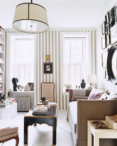
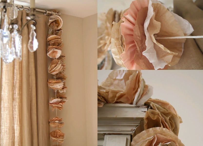
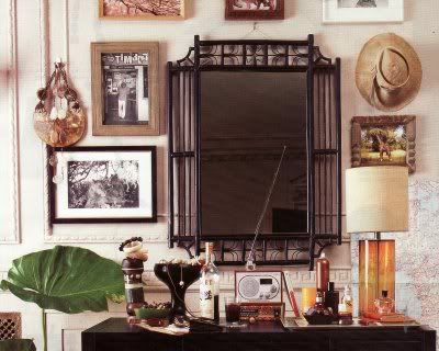
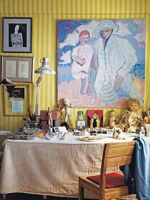
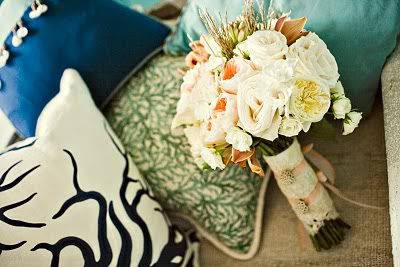
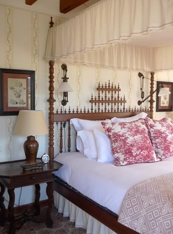
To finish off the night, here are some random photos that I have collected that inspire me, each for a different reason. These aren't necessarily whole rooms that provide inspiration (heaven knows I could post thousands of those that I have saved), but there is something about each photo that triggers my creativity. It could be the color palette, the trim detail, the composition, the lighting, the pattern, the texture...each provides me with a little bit of afflatus.


Photobucket


Photobucket


Photobucket

Photobucket


Photobucket

Photobucket


Photobucket


image sources: click on photo to see source in the file name, otherwise unknown.


www.BrittanyStiles.com

Saturday, March 26, 2011

Maria Trimbell Murals


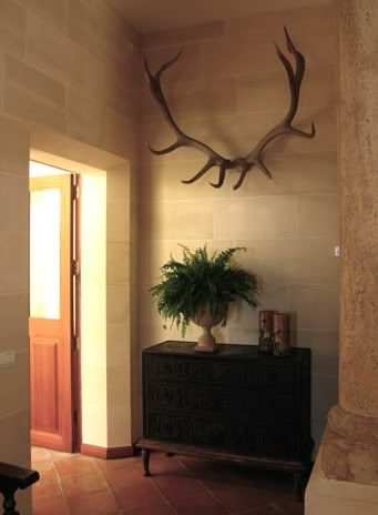
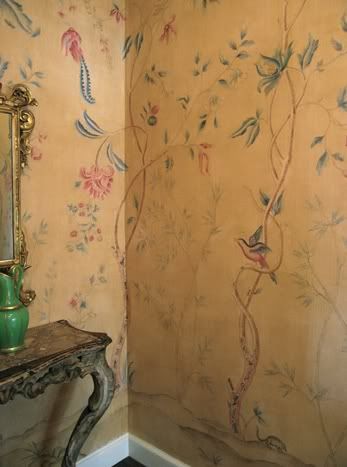
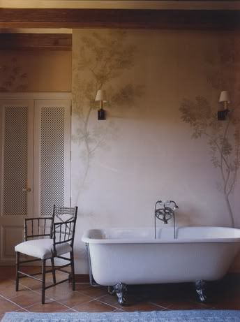
Here are some of the stunning hand painted murals done by Maria Trimbell. As much as I love a good wallpaper, these kind of top the charts for decorative walls.

Photobucket

Photobucket

Photobucket

Photobucket

Photobucket

www.BrittanyStiles.com

Thursday, March 10, 2011

Design Do's & Don'ts

I just came across a list of design do's and don'ts that I made for my first interior design website 4 years ago. I feel like my style has changed and grown a lot in 4 years and I'm sure I could add many more do's and don'ts to this list, but it was interesting to see that I still stand firmly by all of my original design tips.

DON'T settle for poorly made furniture.
DO spend a little more on the key pieces that you want to last, stay comfortable, and still be in style for years to come.

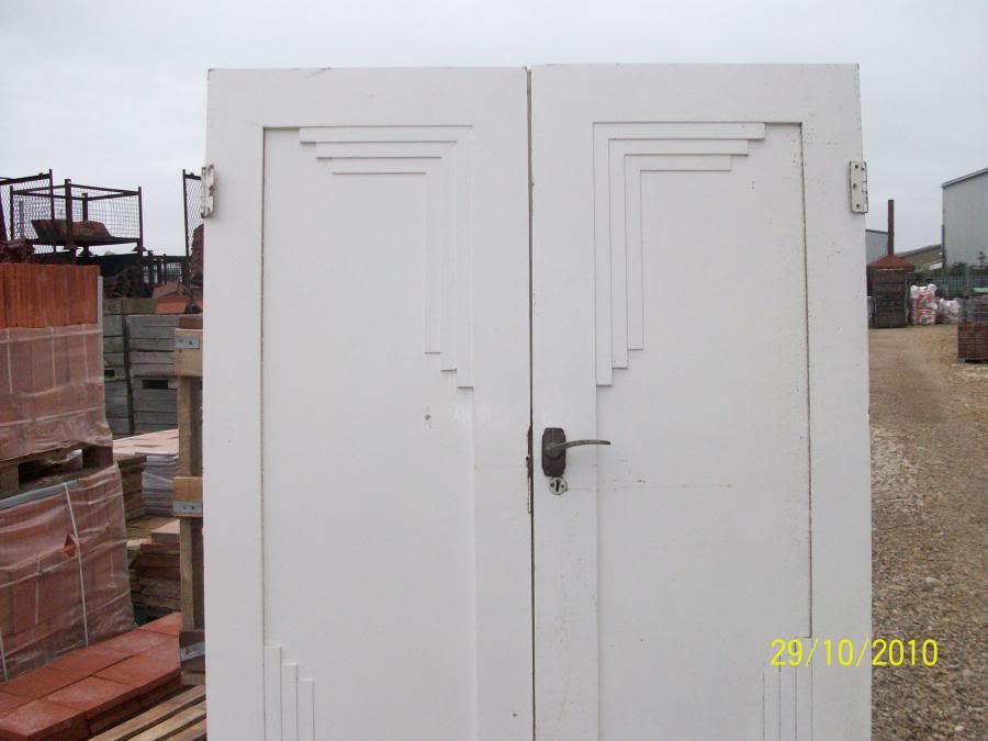
DON'T underestimate the impact and importance of architectural details.
DO invest time and money into crown mouldings, proper window and door casings, substantial baseboards, decorative wainscoting, and high quality flooring. When you create a beautiful canvas, all other things that you bring into the space will automatically look more stylish.

DON't purchase furniture before double checking the size.
DO measure your space available and compare it to the size of the piece. If necessary, tape down the size and shape of your furniture piece before purchasing to be sure it doesn't stick out too far from the wall, and that there is adequate walking space.

DON'T be afraid to mix and match.
DO mix different styles of furniture, different patterns of fabric, different pitcture frames in a grouping, and different sources of lighting, etc. All of these things will add visual interest and create a look that is truly your own.

DON'T let other people tell you that something you love is out of style.
DO remember: if you love something, then it's always in style!

DON'T specify taupe walls, with tan window treatments and light brown furniture, on a neutral travertine floor.
DO add a little spice with contrast! Things like darkly stained wood furniture against white walls; or a bluish-gray sofa with chocolate brown pillows really add excitement and interest to a room.

DON'T go to a furniture showroom and purchase an entire living room or bedroom set.
DO take different pieces from different furniture sources (including antique shops and flea markets) to capture a designer look. You want the room to feel collected.

DON'T hire any random contractor for construction on your home.
DO get contractor referrals from friends, family members, or your designer. Ask them how well the contractor did at things like returning phone calls and completing the project on time.

DON'T feel the urge to always keep the same color scheme throughout the house.
DO make sure that the style is consistent from room to room. The overall design style is more important than color in making different rooms in a home feel connected.

DON'T wait until the last minute to hire a designer if you are planning to hire one anyway.
DO be sure to include your designer in the construction phase of the project; not just in the furnishing phase. Designers can help with deciding on the best layout for walls and cabinetry because they will relate this to where furniture will be placed during the last phase of the project. Also, your designer can help with decisions on what type of architectural details will enhance the interior and give you the complete result you are looking for.

What can I say? I guess I was wise beyond my years.

www.BrittanyStiles.com

Wednesday, March 9, 2011

James Huniford's New Furniture Line

Photobucket

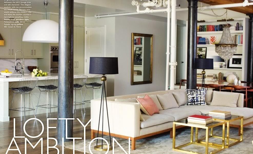
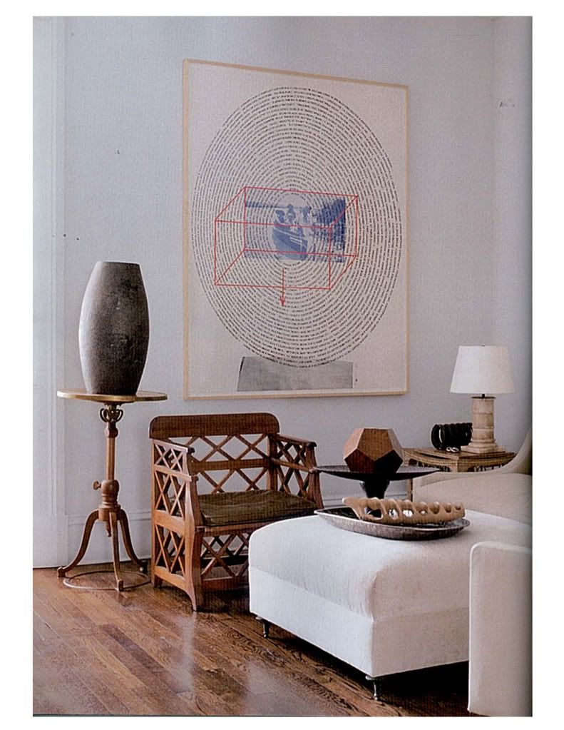
I find inspiration everywhere, which is why I love blogging so much. It gives me a way to catalog and share all of the different inspirations that I come across each day. One sort of obvious way that I get design inspiration is by flipping through design magazines. I really think there is a lot to be learned from analyzing photos of great designers. Recently I used James Huniford's feature in Veranda's September issue as inspiration for a new client's home in Irvine. Below are some of the fabulous images that got my creative juices flowing. This interior is so clean and beautifully modern, without that sterile feeling. Things that I love about this home: the white walls everywhere, the interesting one-of-a-kind furniture pieces that almost act as pieces of art in themselves, and I especially love the way he uses original artwork on the walls to make a strong design statement in each room.


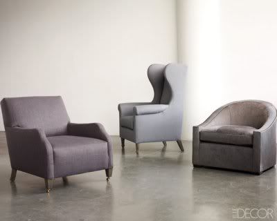
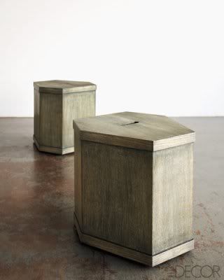
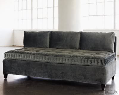
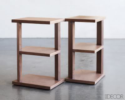
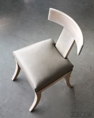
Thanks to Elle Decor's twitter feed, I just found out that Mr. Huniford has a new line of home furnishings. They're modern, classy, and interesting, just like his interiors.

Photobucket

Photobucket

Photobucket

Photobucket

Photobucket

www.BrittanyStiles.com

Tuesday, March 8, 2011

Absolute Vintage, London


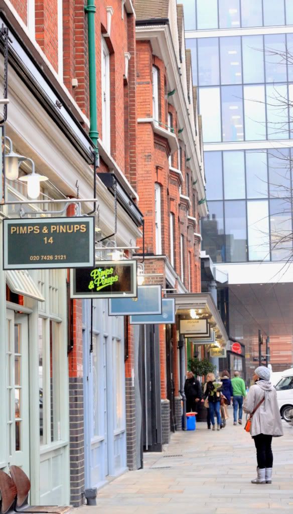
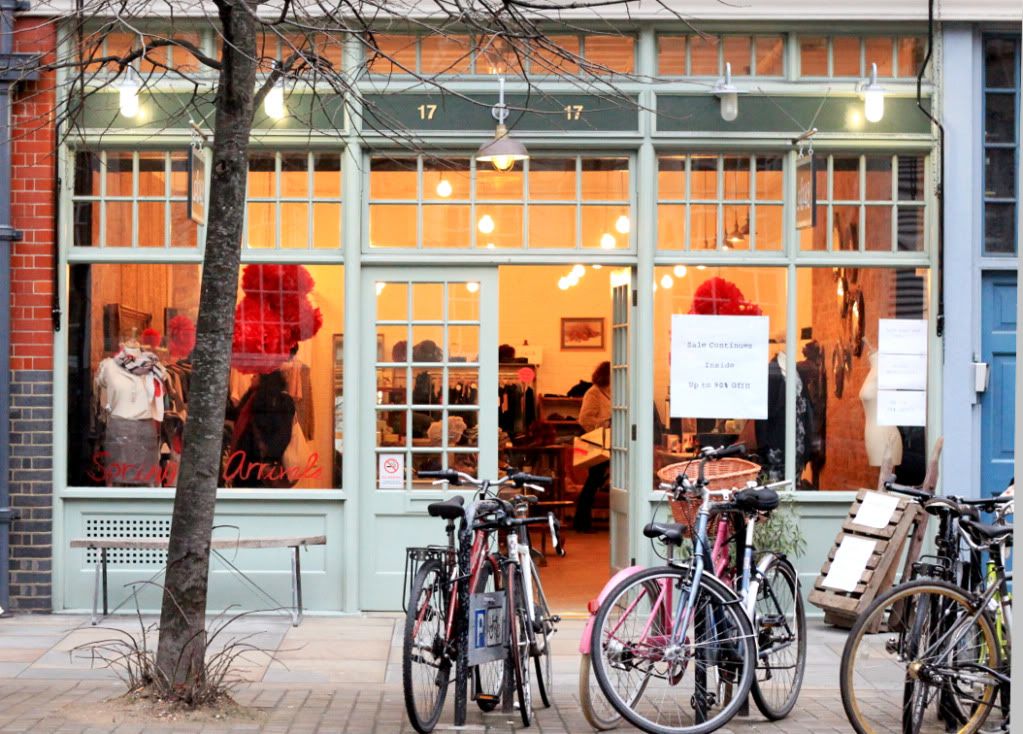
One of my must do's in London was to check out Absolute Vintage, a vintage clothing store voted the #1 vintage store in London by several fashion magazines. The store was in a really great part of town so I snapped a couple of photos on the street (see below). Unfortunately Absolute Vintage doesn't allow photography inside their store, but trust me when I say it was the best vintage clothing store I have ever been to. If you're in to vintage shopping, definitely check it out next time you're in London.


Related Posts Plugin for WordPress, Blogger...