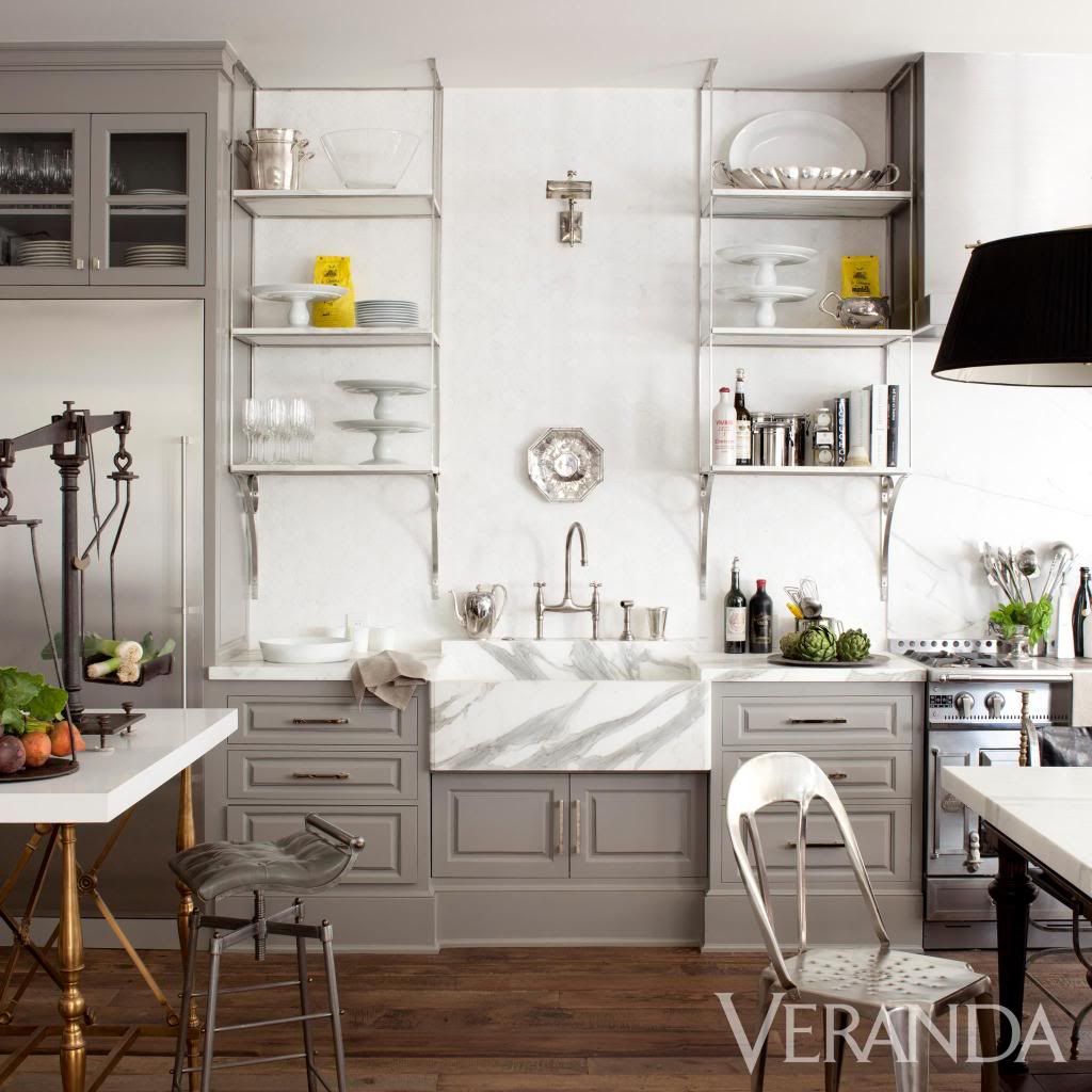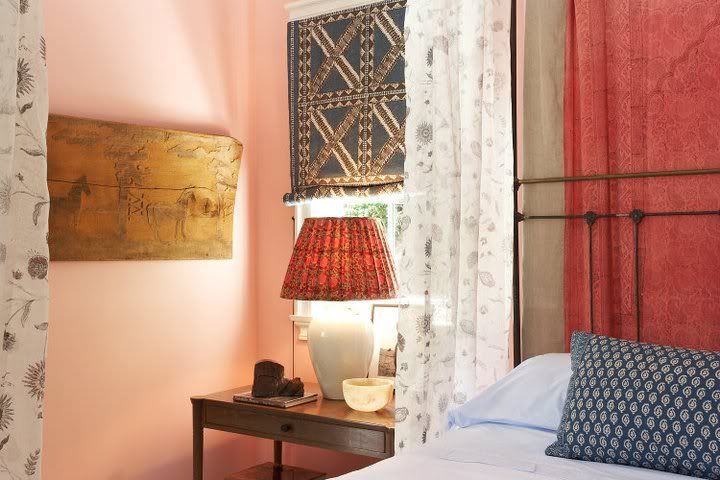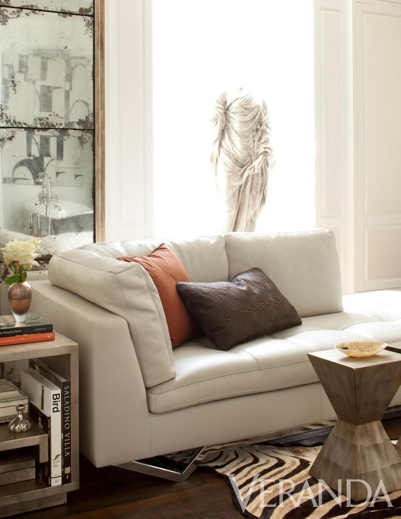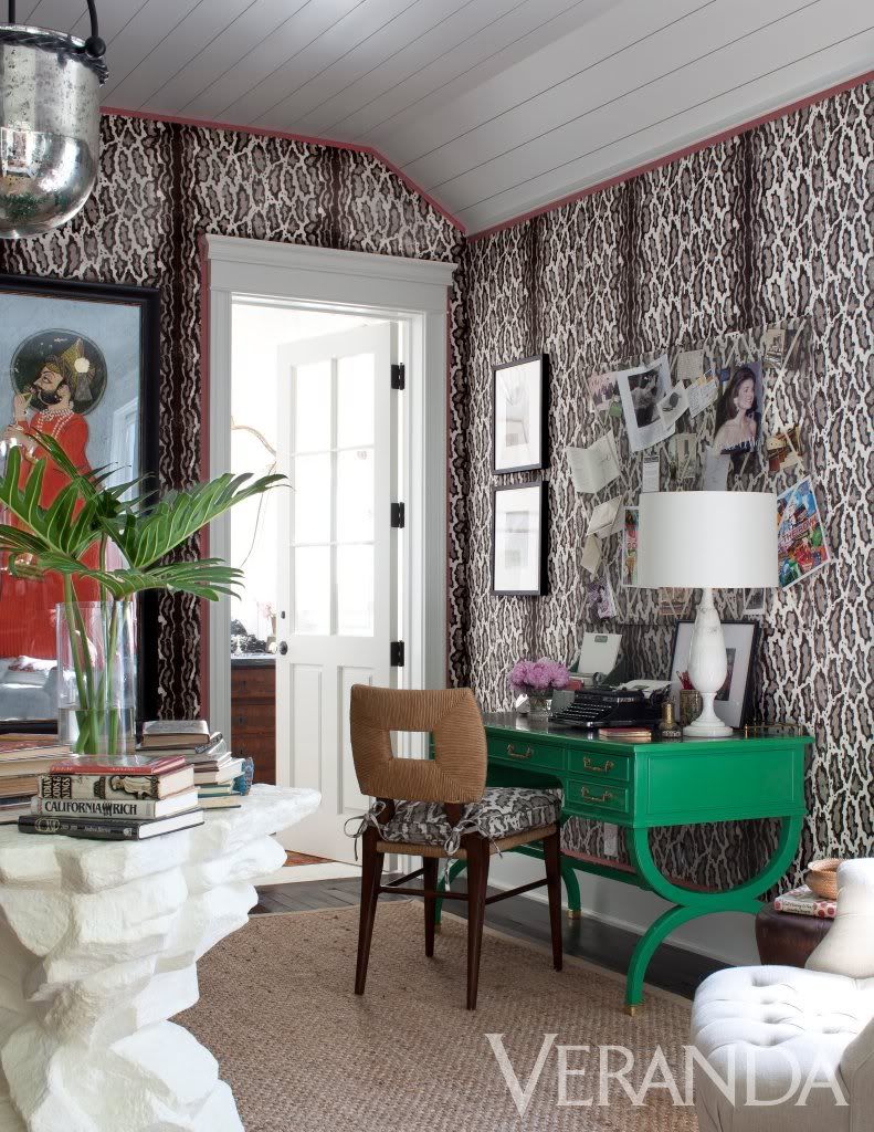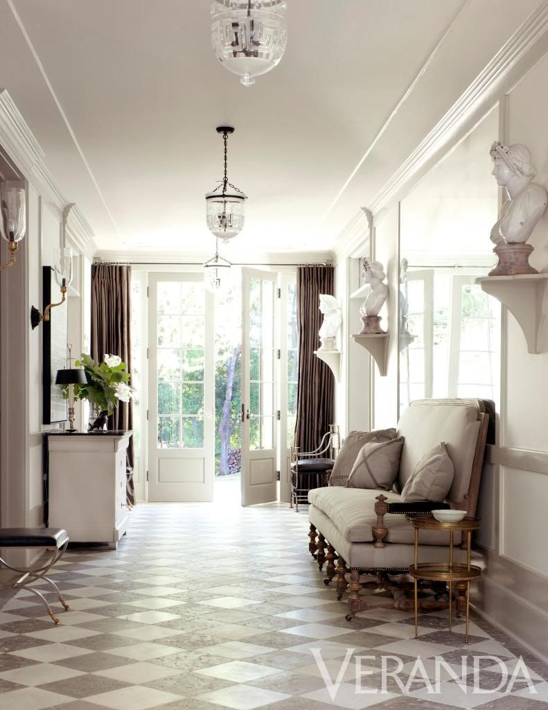
I had the opportunity to spend a few hours there last Saturday as I toured the house and then listened to the panel of designers talk about the process, their inspiration, and ideas behind the 8,300 square foot estate in Brentwood.
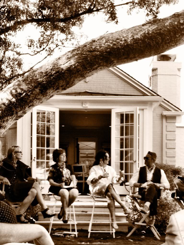
The premise behind the House of Windsor was to design a real home for the real "modern family" and how Windsor sees people living or wanting to live today. This wasn't your average showhouse filled with beautiful furniture, accessories, and wallcovering...although it was most definitely all of those things as well, but it was a house that felt like it had a real family living there already.
Here are some of Windsor's ideas that she shared on the panel of how this project suits the modern family:
- The large dining table smack in the middle of the kitchen that seats up to 16 people and also acts as an island. Windsor shared that everyone gravitates toward the kitchen, so she wanted to turn this fact into a beautiful and functional design element - mission accomplished.
- There are no walk-in closest anywhere in the house, just beautiful built-in cabinetry to hold clothing, shoes, and other wares. Her thinking behind this was that we all accumulate so much "stuff" that just weighs us down. This "stuff" is then put into a closet and we shut the door so that we don't have to see or think about it. Windsor said that by creating beautiful closet space just for the things we love then everytime we open the doors we will only pull out something we have collected that has meaning and is important to us. By taking square footage away from walk-in closets that house things that we don't need or care about, she was able to add that square footage to the living spaces of the house. Fascinating.
- The less is more landscaping gives the house a beautiful rural feel; you'd have no idea that the traffic filled freeways and high rises of LA are just outside the neighborhood. Windsor and Stephen Block collaborated about their vision for the house in terms of the landscaping. The house has a really beautiful yard covered in grass and very minimal on hard-scaping. Stephen brought up the point that many people over hard-scape these days as if they're afraid of, or there is something wrong with, walking on grass. Turns out waking and playing on the grass is quite liberating, you should try it some time.
- The family room is multi-functional. Complete with floor to ceiling bookcases, an extra large ottoman for playing games, a bar, and a large table for projects, homework, eating... you name it.
- The house was a new construction project built from the ground up, but you'd never know by looking at it. The style of the house and the painted brick coupled with the fact that the house is stunning but isn't overdone made me automatically assume this was a home built in the 60's or 70's that has been remodeled for this project. I was wrong, but it turns out that Windsor purposely built the house to make us think this way. I think as a modern society we love the look and feel of old things and appreciate their character, but at the same time we love our technology and the ease and function that it brings to our life. This house was a genius blending of the two worlds.
Obviously I can't say enough good things about this house. It made me think about design in a new way, which I love. I learned so much from this house and from Windsor about how important it is as designers to listen to our clients and take note of how they live and then design homes that will enhance their living, instead of just creating pretty rooms. I learned that it's ok to throw tradition out the window by creating new traditions that are more accommodating to how my clients live today.
